
Picture this: You’re working on project and you’ve just finished collecting all your network data. You’ve worked hard to get a complete network and you’re eager to start analyzing it. You power up your computer, load up Rstudio, and after lots of careful wrangling and tidying, you’re ready to plot the network. With great anticipation, you write a little code and WHAM! you get hit with a hot plate of spaghetti and meatballs.
Anyone who has tried to visualize a network that is even remotely dense can probably relate to this experience. That’s because networks are complex, multidimensional objects; some of the most difficult objects to visualize.
Simplicity of design and the data density problem
The great statistician Edward Tufte is an expert at data visualization. His book The Visual Display of Quantitative Information gives us many guidelines for designing pleasant graphs. But there are two bits of information that will specifically help us understand how to produce effective network visualizations. The first comes from one of his most well known quotations:
Graphical elegance is often found in simplicity of design and complexity of data.
Networks are, by definition, complex objects. This is true even for graphs with a small quantity of nodes and edges. The inherent complexity of networks means that we must always strive for simplicity when we visualize a network. This means you have no choice but to minimize the number of visual aesthetics used in the visualization. Ask yourself: what is the single most essential feature of this network that I want the my audience to appreciate? Let this essence guide your design.
The second piece of advice is to maximize data density, within reason. You can think of data density as the ratio of “data ink” used to plot the data to the amount of black graph space. This principle, for example, guides our decisions about the range of values on the axes of any plot. The axes should be constrained to the range of values for which we actually have data.
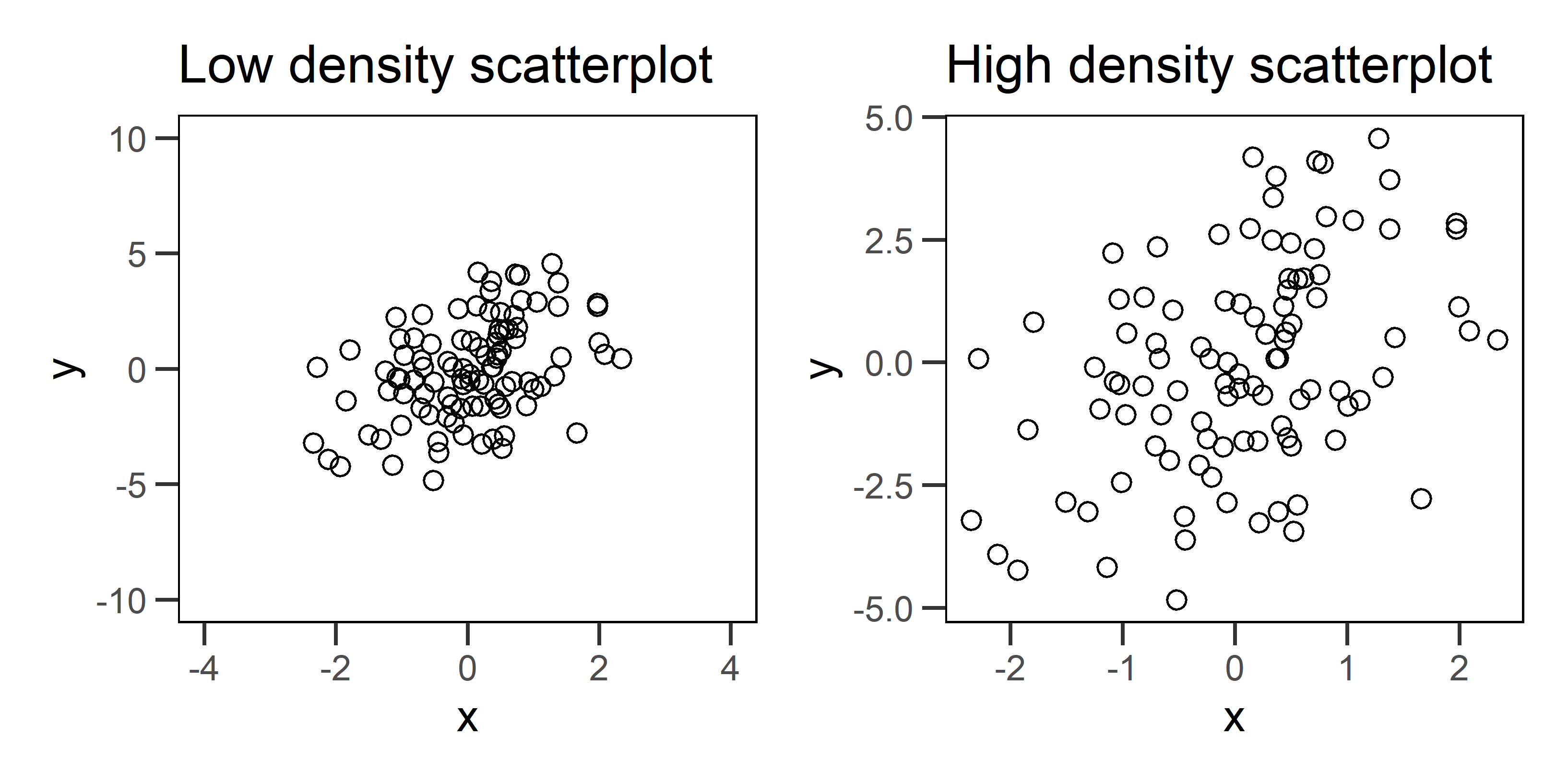
Figure 1: Two example scatterplots for the same data. The plot on the left has low data density that is caused by specifying axis ranges that are well beyond the range of the data. The plot on the right fixes this problem, and as a result, we see a more honest portrayal of the pattern.
Fixing data density problems in conventional graphs, like the scatterplots above, can be pretty simple. But networks pose problems because they tend to have high data density to begin with. This makes any additional aesthetic choice risky because it can take us beyond a reasonable data density that viewers can actually comprehend. There is also no straight forward way to change axes or omit nodes and edges without distorting our representation of the network structure.
Let’s look at some techniques to deal with data density and then we will move on to some other graphical challenges with networks.
Start with a simulation
Let’s start by simulating a network that we can use to illustrate some of these techniques. For details about how to simulate networks using statnet, check out our previous post on the topic. We want to use a simulation because 1) we can create challenges and learn to overcome them, and 2) we know the correct answers for the graph structure and the attributes, which helps us know whether we have been successful or not.
We will simulate a network composed of three groups who tend to form edges with other agents of the same group. This is a homophilous network, and we will keep it fairly dense.
# load package
library(statnet)

# seed for reproducibility
set.seed(777)

# how many nodes? how many groups?
N = 60
groups = c('G1','G2','G3')

# initialize empty network
empty_g = network( N, directed = TRUE, density = 0 )

# create group attribute
empty_g %v% 'group' = sample( groups, size = N, replace = TRUE )

# set parameters for edge density (edges) and homophily (nodematch) and reciprocity (mutual)
# remember these are in log-odds where 0 = 50/50
pars = c(-4,1,2)

# simulate
sim_g = simulate( empty_g ~ edges + nodematch('group') + mutual, coef = pars )
plot(sim_g)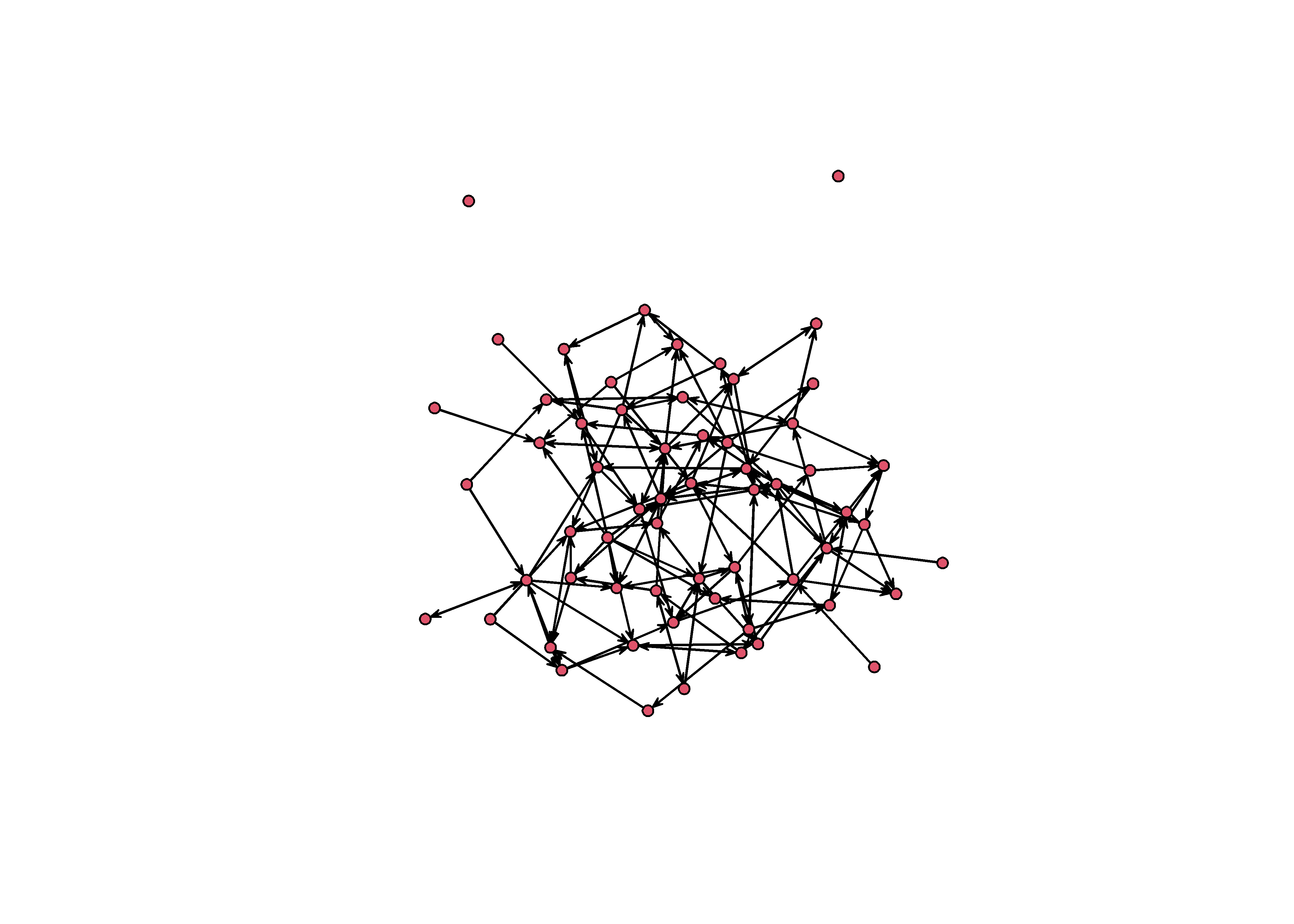
Highlighting group structure
This graph is structured by three groups. We know because we wrote the simulation. But this structure is not obvious from the graph you see above. It looks like spaghetti and meatballs. A good starting point would be to color each node according to it’s group.
# load packages
library(tidygraph)
library(ggraph)

sim_g %>%
    as_tbl_graph %>%
    ggraph() +
    theme_graph() +
    geom_edge_link() +
    geom_node_point( aes(color=group) )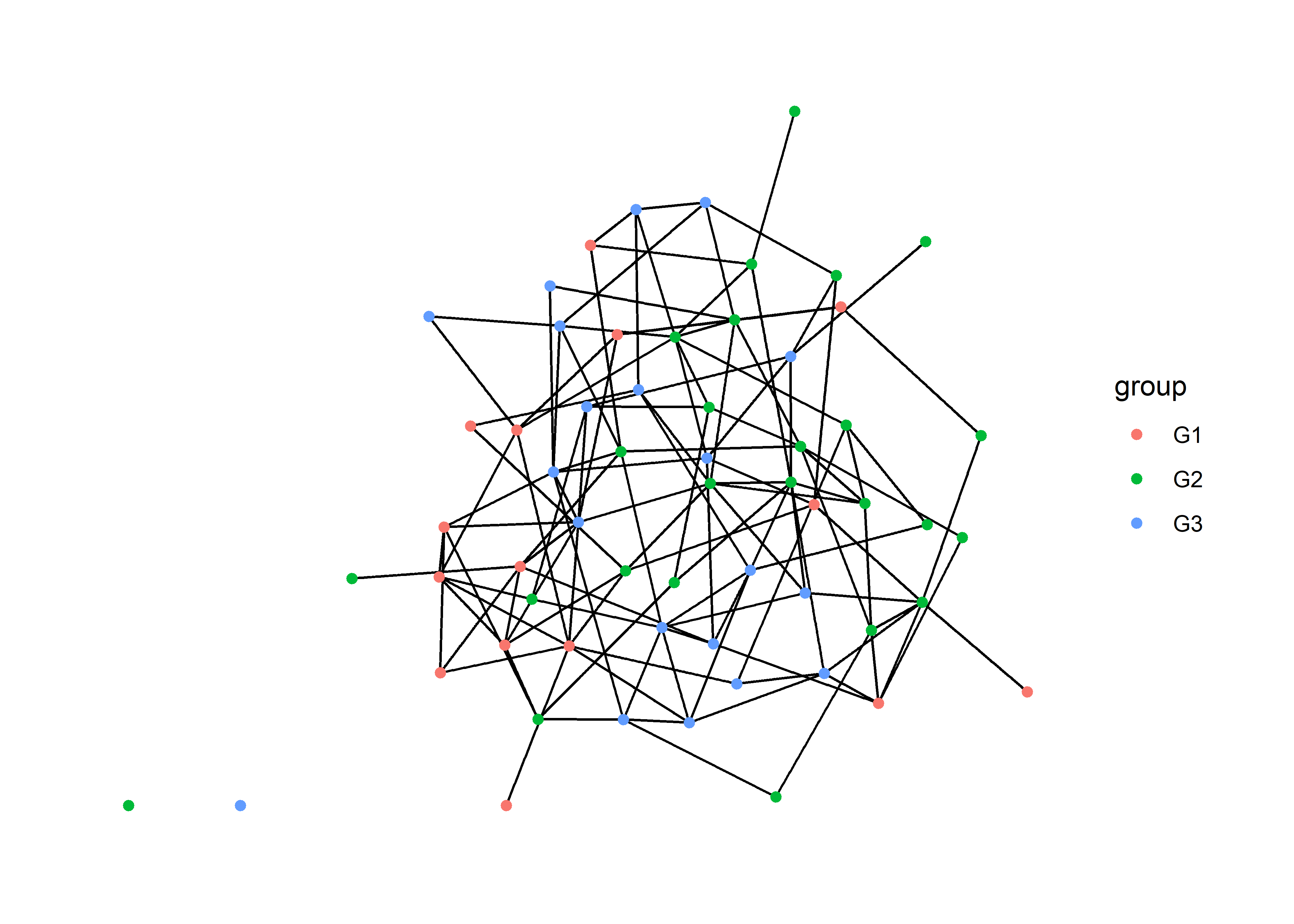
This helps a little bit, but we can do better.
Using small multiples
Tufte advises us to use small multiples – repeated versions of the same graph with different emphases – to maintain data density while improving clarity. When using tools that are based on the grammar of graphics (ggplot2, ggraph, ggdist), we can create small multiples by using facets.
Faceting takes a single graph and splits it into multiple panels based on a factor. In this case, we want to split the graph based on group, a node attribute. For this we want to use facet_nodes.
sim_g %>%
    as_tbl_graph %>%
    ggraph() +
    theme_graph() +
    geom_edge_link() +
    geom_node_point( aes(color=group) ) +
    facet_nodes(~group)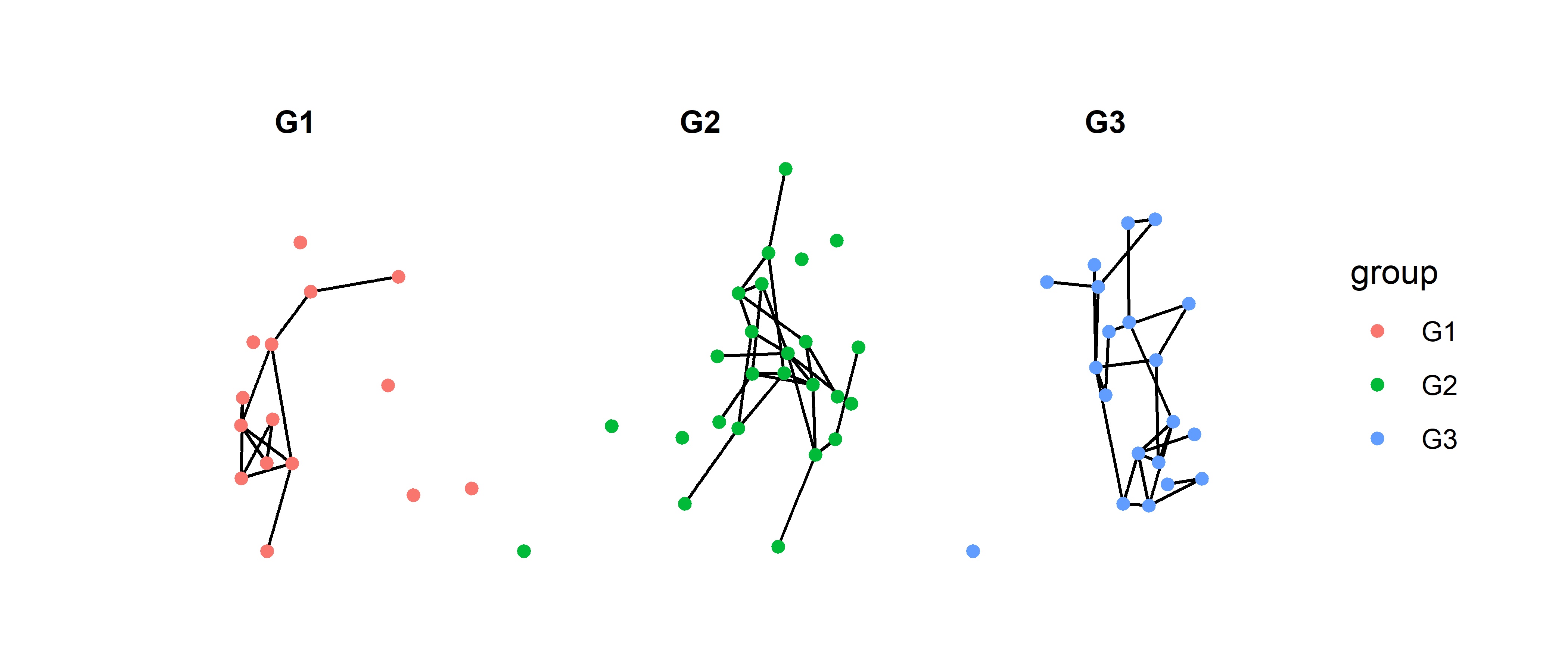
Now we are able to see more clearly how each group is connected in the graph. However, this technique does pose a new problem: it is too easy to assume that these are three separate networks. There are two ways to solve this problem, and they both will require a package called patchwork. This package allows us to combine multiple graphs using + for side to side and / for top and bottom1.
Option 1: Add a reference graph
One choice we have is to plot the network in full as a reference and then use the facets to draw out the subgraphs. We just add them together with patchwork.
# full network
full = sim_g %>%
    as_tbl_graph %>%
    ggraph() +
    theme_graph() +
    geom_edge_link() +
    geom_node_point( aes(color=group) ) +
    theme(legend.position = 'none') +
    ggtitle("Full network")

# sub graphs
sub = sim_g %>%
    as_tbl_graph %>%
    ggraph() +
    theme_graph() +
    geom_edge_link() +
    geom_node_point( aes(color=group) ) +
    facet_nodes(~group) +
    ggtitle("Network subgroups")


full + sub + plot_layout(widths = c(2,5))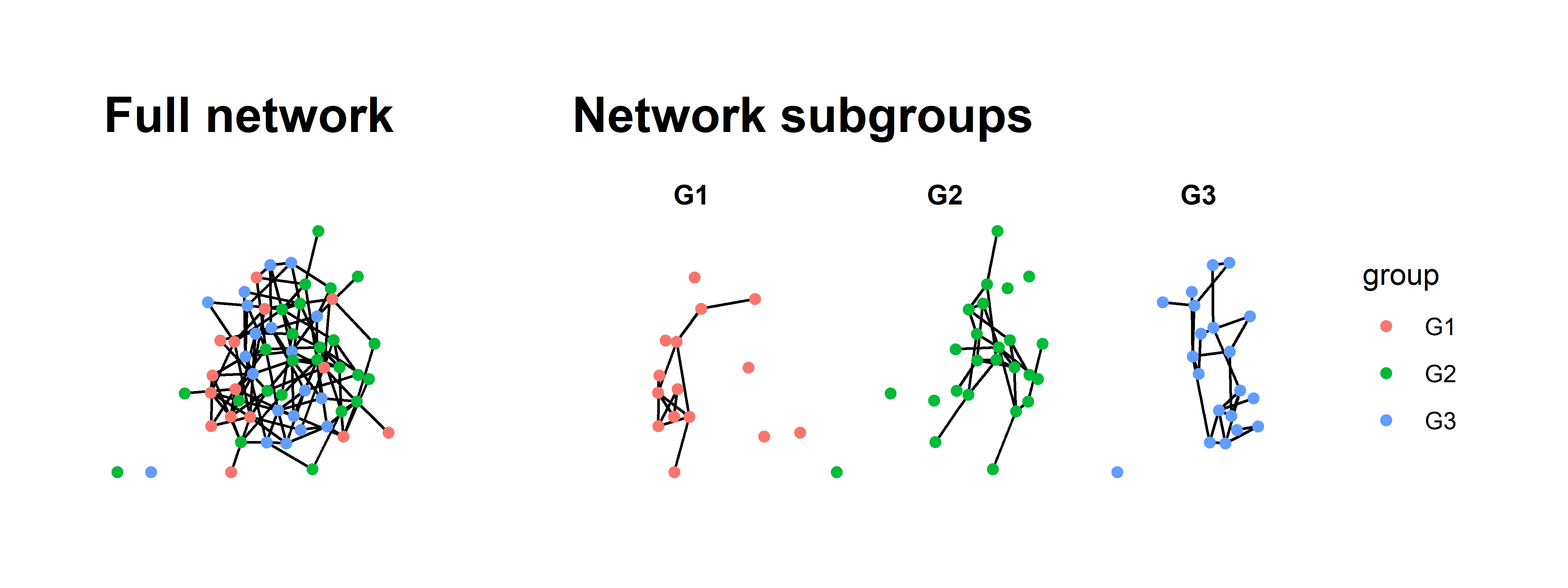
All we have really done in this new graph is the following:
- Plot the full network.
- Plot the faceted version.
- Save plots as objects and add them together.
- Provide titles with
ggtitle. - Remove the legend from the first graph; it is redundant.
- Adjust the relative widths using
plot_layout.
There is more we could do to make it even prettier but this really helps clarify the full network.
Option 2: Plot three separate networks with different emphases
The second option is similar to the first but takes a different path. We will plot the network three separate times but in each graph, we will de-emphasize all but one group. Again, we can string these together using patchwork.
This approach is slightly more complicated then the first because we want to emphasize both the nodes and edges in each group. To do this, we need to create edge attributes for edges that connect between the groups G1, G2, G3 as well those edges that are not homophilous.
sim_g = sim_g %>%
    as_tbl_graph() %>%
    activate(edges) %>%
    mutate(group_from = .N()$group[from],
           group_to   = .N()$group[to],
           group_match = ifelse( group_from == 'G1' & group_to == 'G1', 'G1',
                                 ifelse( group_from == 'G2' & group_to == 'G2', 'G2',
                                         ifelse( group_from == 'G3' & group_to == 'G3', 'G3', 'No match' ))))
sim_g
## # A tbl_graph: 60 nodes and 136 edges
## #
## # A directed simple graph with 3 components
## #
## # Edge Data: 136 × 6 (active)
## from to na group_from group_to group_match
## <int> <int> <lgl> <chr> <chr> <chr>
## 1 1 3 FALSE G1 G1 G1
## 2 1 37 FALSE G1 G3 No match
## 3 2 11 FALSE G2 G3 No match
## 4 2 21 FALSE G2 G3 No match
## 5 2 22 FALSE G2 G2 G2
## 6 2 32 FALSE G2 G3 No match
## # … with 130 more rows
## #
## # Node Data: 60 × 3
## group na name
## <chr> <lgl> <chr>
## 1 G1 FALSE 1
## 2 G2 FALSE 2
## 3 G1 FALSE 3
## # … with 57 more rowsThis code looks a bit more intimidating than it really is. What we have are two essential steps:
Code each edge according to the group of each sender (
group_from) and each receiver (group_to). This is done by activating the edges (activate(edges)) and then using the.N()$group[from]and.N()$group[to]syntax to pull out the node attributes at beginning and end of each edge.Next, we use these two new edge attributes within some nested
ifelsestatements where we ask if the groups are the same, and if so, assign that group to the edge.
Once we have those attributes, we can use them to color the nodes and edges.
g1 = sim_g %>%
    ggraph() +
    theme_graph() +
    geom_edge_link( aes(color=group_match) ) +
    geom_node_point( aes( color=group) ) +
    scale_edge_color_manual( values = c('#ad003f','#cccccc77','#cccccc77','#cccccc77'), guide = NULL) +
    scale_color_manual(values = c('#ad003f','#cccccc77','#cccccc77'), guide = NULL) +
    ggtitle('Group 1')

g2 = sim_g %>%
    ggraph() +
    theme_graph() +
    geom_edge_link( aes(color=group_match) ) +
    geom_node_point( aes( color=group) ) +
    scale_edge_color_manual( values = c('#cccccc77','#d2a52e','#cccccc77','#cccccc77'), guide = NULL) +
    scale_color_manual(values = c('#cccccc77','#d2a52e','#cccccc77'), guide = NULL) +
    ggtitle('Group 2')

g3 = sim_g %>%
    ggraph() +
    theme_graph() +
    geom_edge_link( aes(color=group_match) ) +
    geom_node_point( aes( color=group) ) +
    scale_edge_color_manual( values = c('#cccccc77','#cccccc77','#00c994','#cccccc77'), guide = NULL) +
    scale_color_manual(values = c('#cccccc77','#cccccc77','#00c994'), guide = NULL) +
    ggtitle('Group 3')

g1 + g2 + g3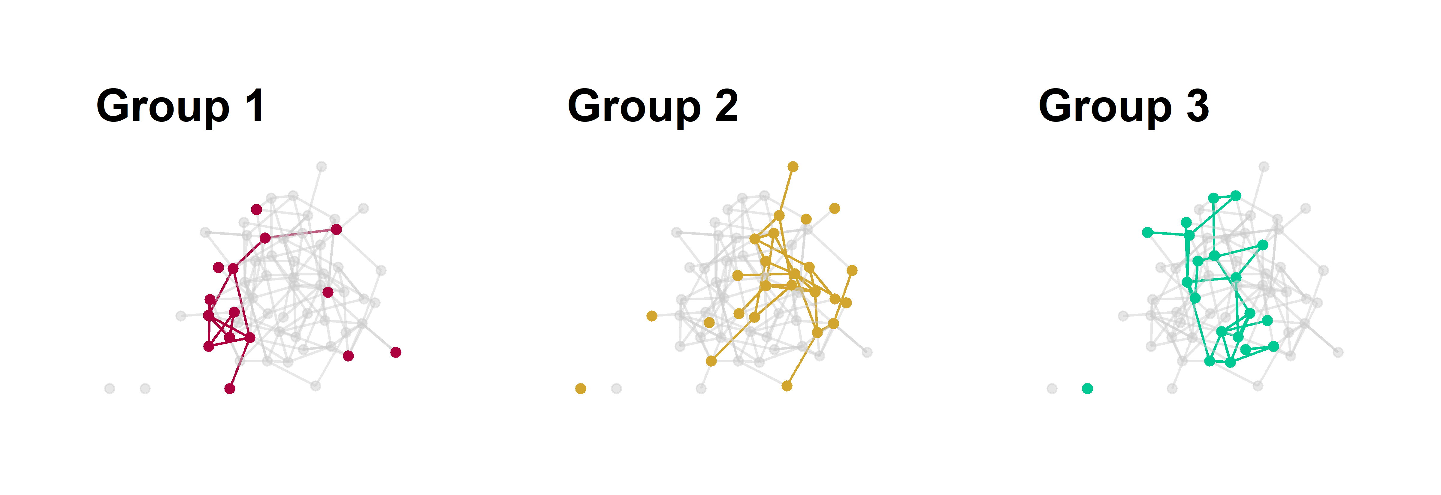
Figure 2: Group substructure in a homophilous network. Each panel emphasizes one group of nodes in the graph with all other edges colored grey.
Now we’ve just repeated the same graph three times. We use an all grey palette and just switch out one of the grey colors for a emphasis color based on the position of the group name in the vector, e.g., group 1 is position 1 in the vector of color values.
One complication with this approach is how to create a legend. There is a solution to this but it requires making plot with all the colors, extracting only the legend, and then plotting the legend alone in a fourth panel. I’ve gotten around this by using titles and explaining the colors in the caption.
A note on layouts
We will focus on layouts a bit more later on in this post, but I just want to make one thing explicit about the two examples above:
The layout must be the same for each graph, otherwise it will be impossible to visually compare the structure across graphs.
The layout for these graphs is the ggraph default called "stress". Because this layout does not randomly change each time we make a plot – unlike Fruchterman-Reingold layouts, for example – we don’t need to do anything special. But if you want to use a different layout that has more randomness to it, you can save the layout first and then reuse it. This is done within igraph but can be transferred to ggraph with no problems.
# same layout fr
lo = layout_with_fr(sim_g)
plot(sim_g, layout = lo)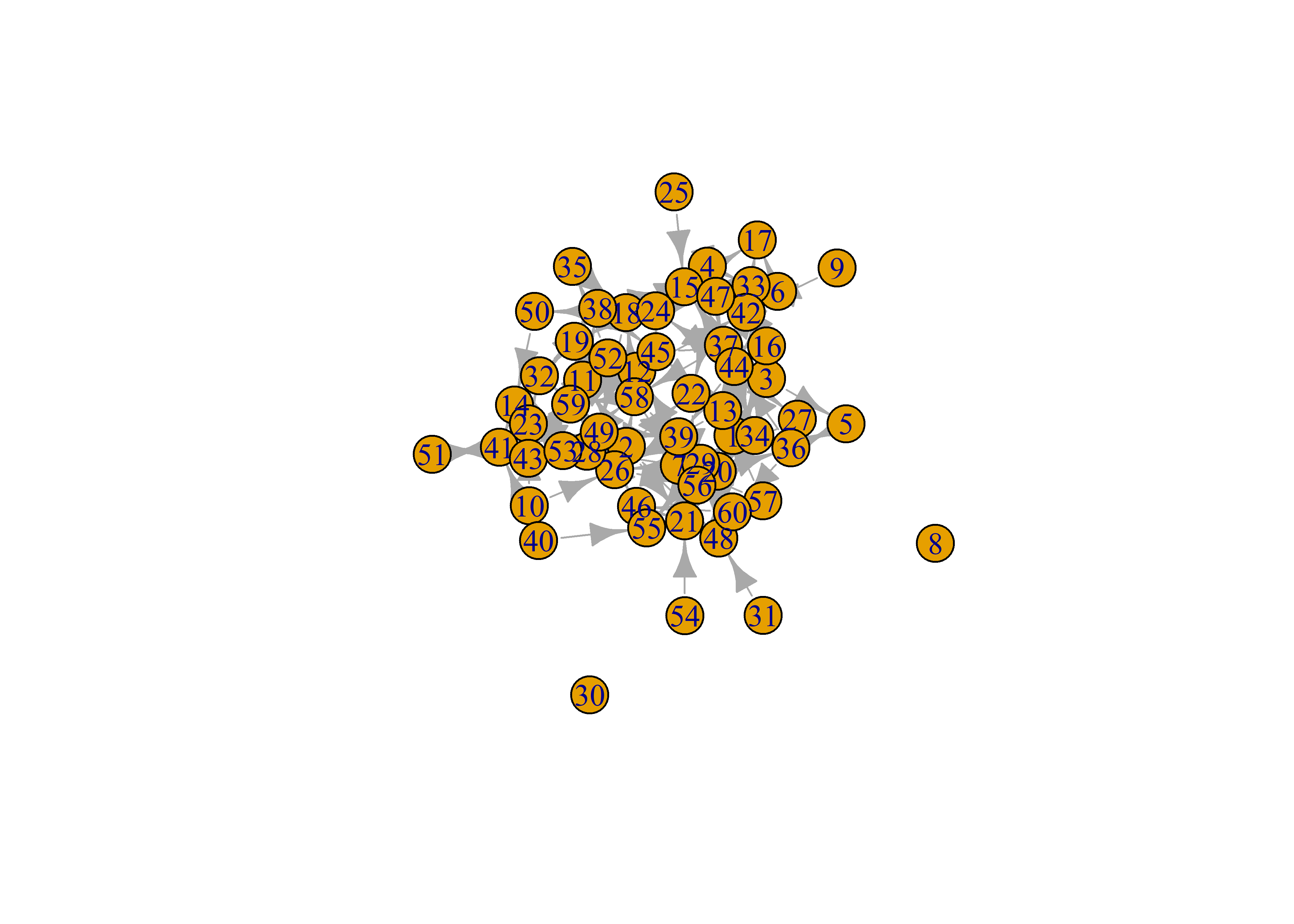
# use lo in ggraph
sim_g %>%
    ggraph(layout = lo) +
    geom_edge_link() +
    geom_node_point()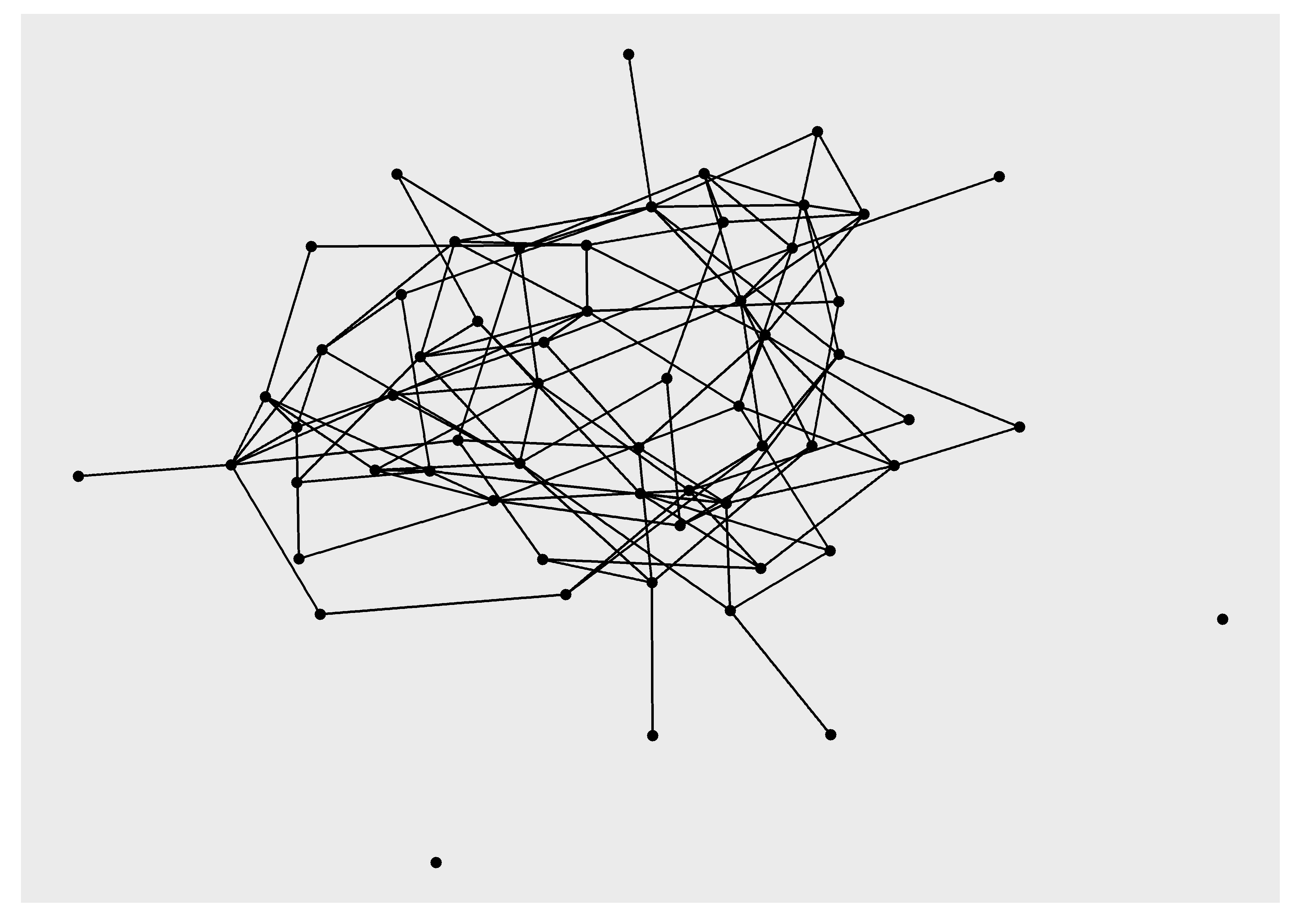
Homophily and Reciprocity
The examples using small multiples have already provided some of the tools for visualizing dyadic attributes. Let’s dig a little deeper into dyads by creating visualizations that highlight homophily and reciprocity.
But first, a new simulation of a larger network.
# seed for reproducibility
set.seed(777)

# how many nodes? how many groups?
N = 100
groups = c('G1','G2','G3')

# initialize empty network
empty_g = network( N, directed = TRUE, density = 0 )

# create group attribute
empty_g %v% 'group' = sample( groups, size = N, replace = TRUE )

# set parameters for edge density (edges) and homophily (nodematch) and reciprocity (mutual)
# remember these are in log-odds where 0 = 50/50
pars = c(-5.5,3,2)

# simulate
sim_g = simulate( empty_g ~ edges + nodematch('group') + mutual, coef = pars )
plot(sim_g)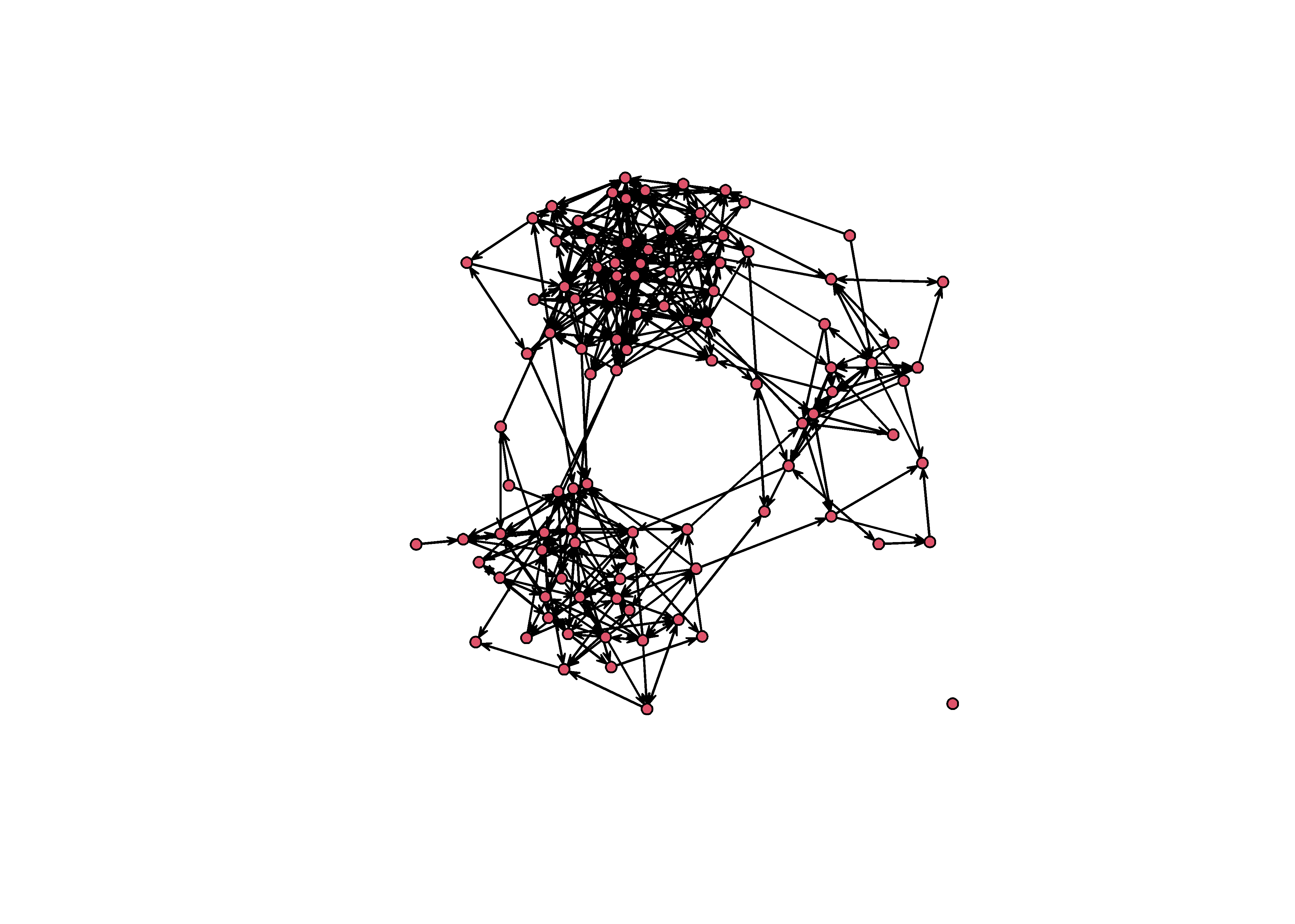
Homophily
Instead of visualizing homophily among groups using multiples, let’s do this on a single graph. We can usual a similar approach to the one above where we tag edges based on the sender and receiver.
sim_g = sim_g %>%
    as_tbl_graph() %>%
    activate(edges) %>%
    mutate(group_from = .N()$group[from],
           group_to   = .N()$group[to],
           group_match = ifelse( group_from == 'G1' & group_to == 'G1', 'G1',
                                 ifelse( group_from == 'G2' & group_to == 'G2', 'G2',
                                         ifelse( group_from == 'G3' & group_to == 'G3', 'G3', 'None' ))))
Now we can map an edge color onto the group_match edge attribute, except this time we want to provide all of our colors in a single palette instead of swapping them out like we did before. In the previous version, we removed the legend by using guide = NULL but these time we want to keep the legend, so we remove these lines.
p = sim_g %>%
    ggraph('mds') +
    theme_graph() +
    geom_edge_link( aes(color=group_match), alpha=0.5 ) +
    geom_node_point( aes( color=group) ) +
    scale_edge_color_manual( values = c('#ad003f','#3300ff','springgreen','#aaaaaa')) +
    scale_color_manual(values = c('#ad003f','#3300ff','springgreen'))
p 
Here I am using the multidimensional scaling layout (mds) because it will give us more separation between the groups. With these layout we see very clearly the edge which occur between groups (e.g., “None”).
Let’s also clean up the legend a bit by change the legend labels. We do this using the labs layer.
p + labs(edge_color='Homophily', color='Group')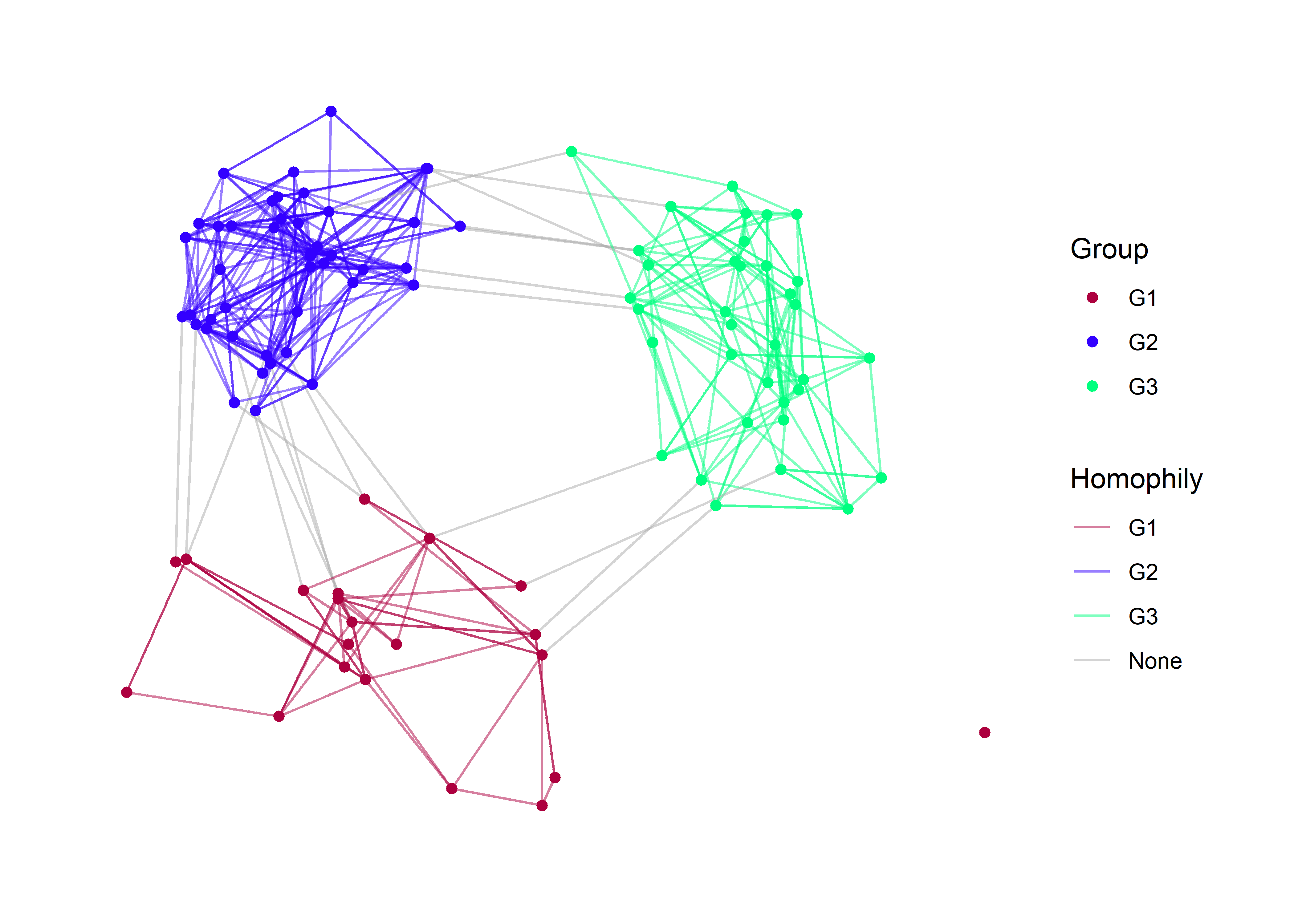
Reciprocity
To visualize reciprocity, we may have to sacrifice our homophily aesthetic, as this would be much too complicated for a viewer. The basic setup is to tag every edge which is reciprocal. The easiest function for doing this is called is.mutual from the {igraph} package. This function does not work with network objects created in {statnet} but it does work with igraph objects or tbl_graph objects.
class(sim_g)## [1] "tbl_graph" "igraph"is.mutual(sim_g)## [1] FALSE TRUE FALSE FALSE FALSE TRUE TRUE TRUE FALSE FALSE FALSE FALSE
## [13] FALSE TRUE FALSE FALSE FALSE TRUE FALSE FALSE FALSE TRUE FALSE FALSE
## [25] TRUE FALSE TRUE FALSE FALSE TRUE FALSE FALSE FALSE TRUE TRUE FALSE
## [37] FALSE FALSE FALSE TRUE FALSE FALSE FALSE FALSE TRUE FALSE TRUE TRUE
## [49] FALSE FALSE TRUE FALSE TRUE TRUE TRUE FALSE TRUE FALSE FALSE FALSE
## [61] FALSE FALSE TRUE FALSE FALSE FALSE TRUE FALSE TRUE TRUE FALSE FALSE
## [73] TRUE FALSE FALSE FALSE TRUE TRUE FALSE FALSE FALSE FALSE FALSE TRUE
## [85] TRUE FALSE FALSE TRUE TRUE TRUE FALSE FALSE FALSE FALSE FALSE FALSE
## [97] TRUE FALSE TRUE FALSE FALSE FALSE FALSE TRUE FALSE FALSE TRUE FALSE
## [109] FALSE TRUE TRUE FALSE FALSE FALSE FALSE FALSE FALSE FALSE FALSE TRUE
## [121] TRUE FALSE FALSE FALSE FALSE TRUE FALSE TRUE FALSE FALSE TRUE TRUE
## [133] FALSE FALSE FALSE TRUE TRUE TRUE FALSE FALSE TRUE FALSE FALSE FALSE
## [145] FALSE FALSE FALSE FALSE FALSE TRUE TRUE FALSE TRUE TRUE FALSE TRUE
## [157] FALSE TRUE TRUE TRUE TRUE FALSE FALSE FALSE TRUE TRUE FALSE TRUE
## [169] FALSE TRUE FALSE TRUE TRUE FALSE FALSE FALSE FALSE FALSE FALSE FALSE
## [181] FALSE FALSE FALSE TRUE TRUE TRUE TRUE FALSE TRUE FALSE TRUE TRUE
## [193] TRUE FALSE FALSE TRUE TRUE FALSE TRUE FALSE FALSE FALSE FALSE TRUE
## [205] FALSE TRUE FALSE TRUE FALSE FALSE FALSE FALSE FALSE TRUE FALSE FALSE
## [217] FALSE TRUE FALSE TRUE TRUE FALSE FALSE TRUE TRUE FALSE FALSE FALSE
## [229] TRUE TRUE FALSE TRUE TRUE FALSE TRUE FALSE FALSE FALSE TRUE FALSE
## [241] FALSE FALSE FALSE TRUE FALSE FALSE FALSE TRUE TRUE FALSE FALSE FALSE
## [253] TRUE FALSE FALSE TRUE FALSE FALSE FALSE FALSE FALSE FALSE TRUE TRUE
## [265] FALSE FALSE TRUE FALSE TRUE FALSE TRUE FALSE FALSE FALSE FALSE FALSE
## [277] FALSE TRUE TRUE FALSE FALSE FALSE FALSE TRUE FALSE TRUE TRUE FALSE
## [289] FALSE FALSE FALSE FALSE TRUE TRUE FALSE FALSE FALSE TRUE FALSE FALSE
## [301] TRUE FALSE FALSE FALSE TRUE TRUE FALSE FALSE TRUE FALSE TRUE TRUE
## [313] FALSE FALSE FALSE FALSE FALSE TRUE FALSE FALSE FALSE FALSE TRUE FALSE
## [325] TRUE TRUE FALSE FALSE FALSE TRUE TRUE FALSE FALSE FALSE FALSE TRUE
## [337] FALSE FALSE FALSE FALSE FALSE FALSE FALSE FALSE FALSE TRUE FALSE FALSE
## [349] TRUE FALSE FALSE TRUE FALSE FALSE FALSE FALSE TRUE TRUE TRUE TRUE
## [361] TRUE FALSE FALSE FALSE TRUE TRUE TRUE FALSE FALSE FALSE FALSE FALSE
## [373] FALSE FALSE FALSE FALSE FALSE FALSE FALSE TRUE FALSE FALSE FALSE FALSE
## [385] FALSE FALSE FALSE TRUE FALSE FALSE TRUE FALSE FALSE FALSE FALSE TRUE
## [397] FALSE FALSE TRUE FALSE TRUE FALSE FALSE TRUE TRUE FALSEThe function returns a TRUE or FALSE value that indicates whether or not that edge is reciprocated. We can create a new edge attribute and label it with these T/F values. You can do this using the igraph syntax (E(sim_g)) or by using tidygraph. I’ll show both below.
# igraph method
E(sim_g)$Reciprocity = is.mutual(sim_g)

# tidygraph methods
sim_g %>%
    activate(edges) %>%
    mutate(Reciprocity = is.mutual(sim_g))
## # A tbl_graph: 100 nodes and 406 edges
## #
## # A directed simple graph with 2 components
## #
## # Edge Data: 406 × 7 (active)
## from to na group_from group_to group_match Reciprocity
## <int> <int> <lgl> <chr> <chr> <chr> <lgl>
## 1 1 15 FALSE G2 G3 None FALSE
## 2 1 22 FALSE G2 G2 G2 TRUE
## 3 1 36 FALSE G2 G2 G2 FALSE
## 4 1 65 FALSE G2 G2 G2 FALSE
## 5 2 24 FALSE G2 G2 G2 FALSE
## 6 2 44 FALSE G2 G2 G2 TRUE
## # … with 400 more rows
## #
## # Node Data: 100 × 3
## group na name
## <chr> <lgl> <chr>
## 1 G2 FALSE 1
## 2 G2 FALSE 2
## 3 G2 FALSE 3
## # … with 97 more rowsArmed with out new edge attribute, we can plot the network by mapping a color to this attribute. I find that black and transparent grey are ideal for this attribute. Keep it simple.
sim_g %>%
    ggraph() +
    theme_graph() +
    geom_edge_link( aes(color=Reciprocity) ) +
    geom_node_point( ) +
scale_edge_color_manual( values = c('#aaaaaa55','black')) 
Working with arrows
There is something glaringly missing from this directed graph: arrows. Arrows are tricky with networks because they add visual clutter. We should only use them when we absolutely need to, and in this case, where we are communicating patterns fo reciprocity, it would be great to have some arrows.
We handle arrows in a ggraph by using an arrow argument. There are a few things to consider here:
- How large should the arrows be?
- What angle should we used for the arrowhead?
- Should the arrow heads touch the nodes?
Personally, I prefer smaller arrows for less clutter and I prefer the arrowheads do not touch the nodes. Let’s look at a simple example first.
x = 1:3
grid = expand.grid(x,x)
grid = grid[ !grid$Var1 == grid$Var2, ]
Here I’ve create a simple grid of node pairs 1, 2, and 3 and removed all of the loops in the grid. Now let’s make a plot with them so that you can see how the arrow arguments work.
grid %>%
    as_tbl_graph() %>%
    ggraph() +
    theme_graph() +
    geom_edge_link( arrow = arrow( angle=30, length = unit(3, 'mm'), type = 'closed') ) +
    geom_node_point()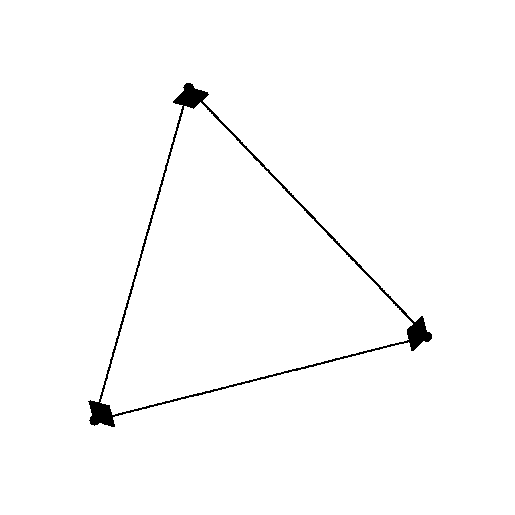
Not particularly pretty. We can’t really see the nodes, the arrow heads are too long and the angle is much to wide.
grid %>%
    as_tbl_graph() %>%
    ggraph() +
    theme_graph() +
    geom_edge_link( arrow = arrow( angle=20, length = unit(2, 'mm'), type = 'closed') ) +
    geom_node_point()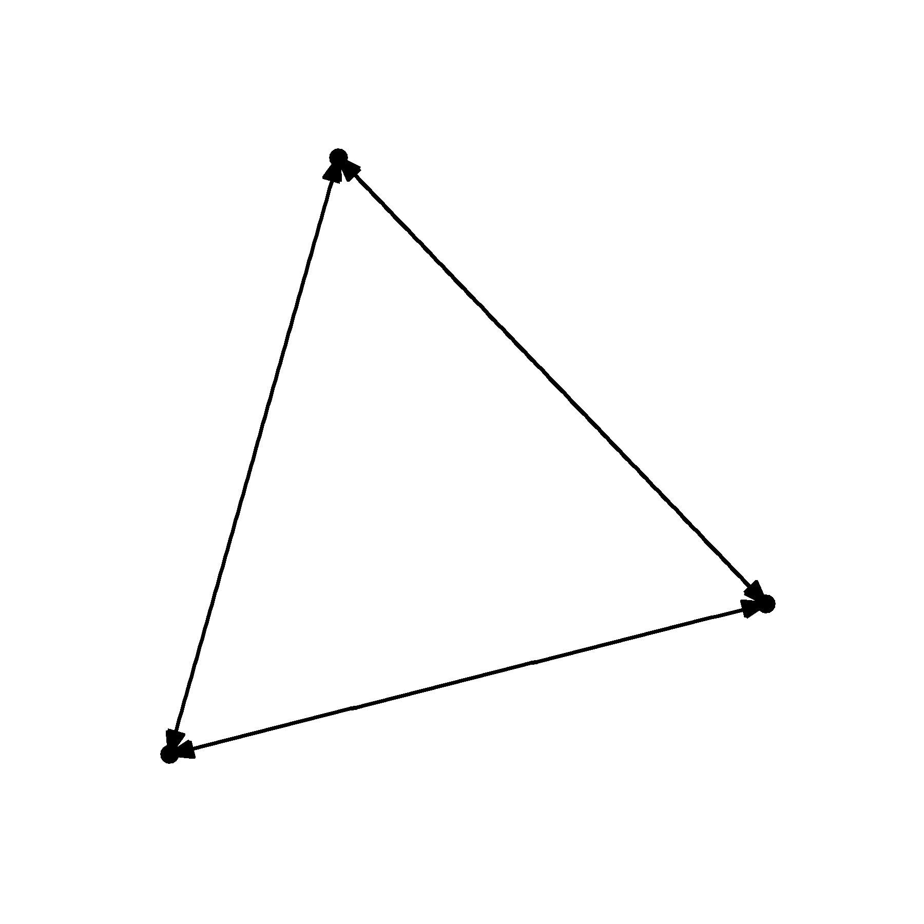
That is starting to look a little better. But it would be great if we could prevent the arrowheads from touching the nodes. For this, we need to manipulate the end_cap and start_cap.
grid %>%
    as_tbl_graph() %>%
    ggraph() +
    theme_graph() +
    geom_edge_link( arrow = arrow( angle=20, length = unit(2, 'mm'), type = 'closed'),
                    end_cap = circle(2,'mm') ) +
    geom_node_point()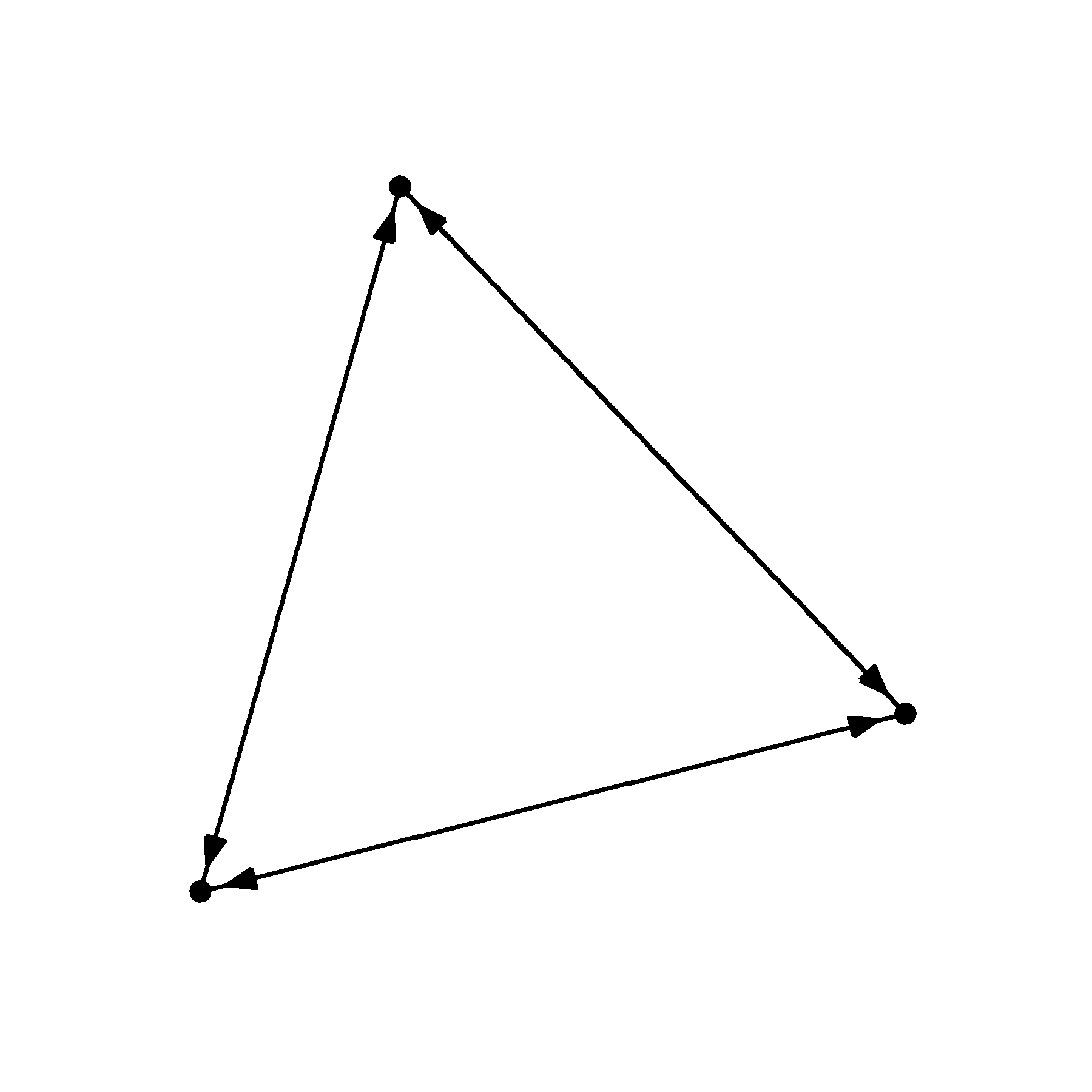
I’ve supplied a circle to the end_cap argument telling R that I want to leave a circular buffer that has a 2 mm radius. But because the edges are flowing in all directions, we need to supply the same argument to the start_cap.
grid %>%
    as_tbl_graph() %>%
    ggraph() +
    theme_graph() +
    geom_edge_link( arrow = arrow( angle=20, length = unit(2, 'mm'), type = 'closed'),
                    end_cap = circle(2,'mm'),
                    start_cap = circle(2,'mm')) +
    geom_node_point()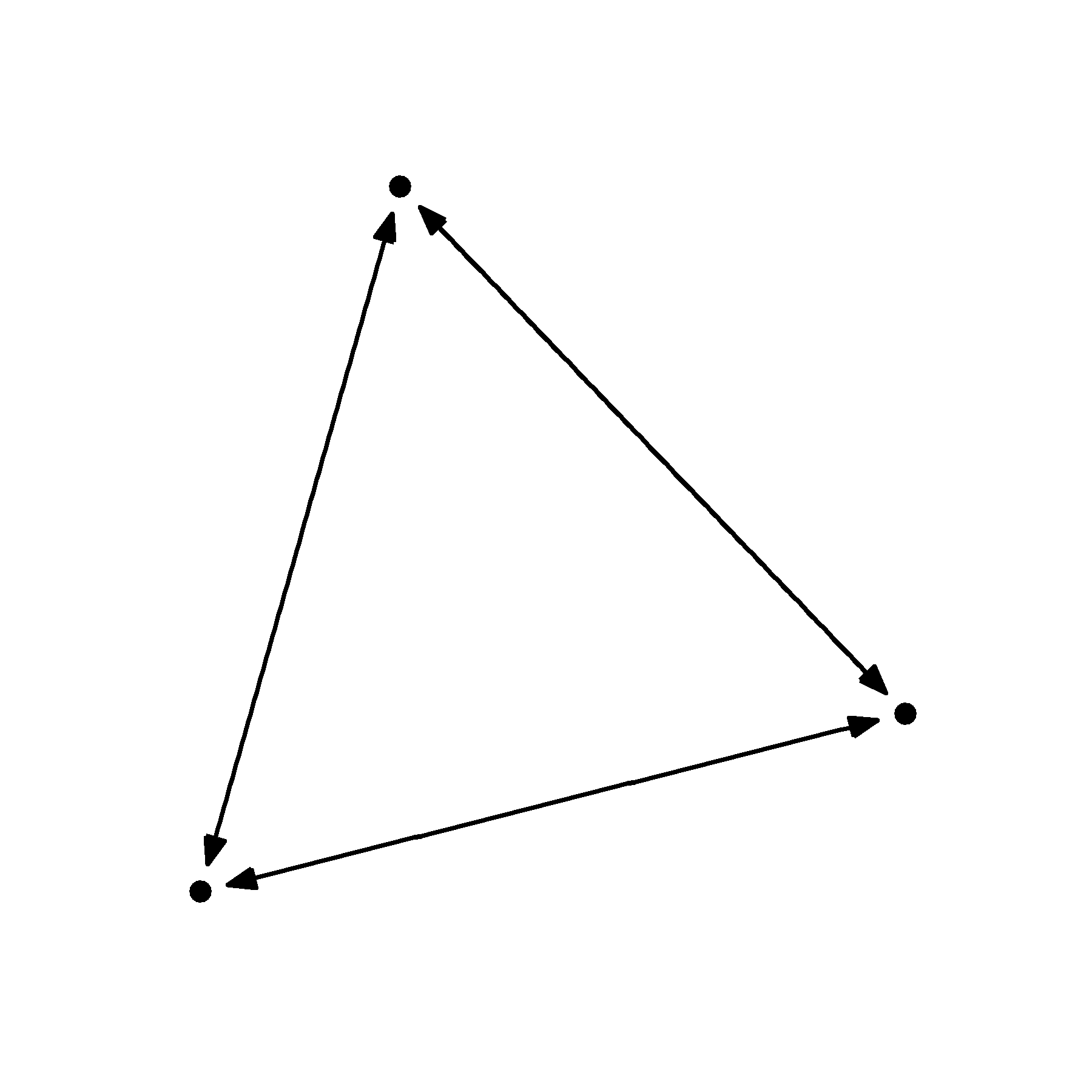
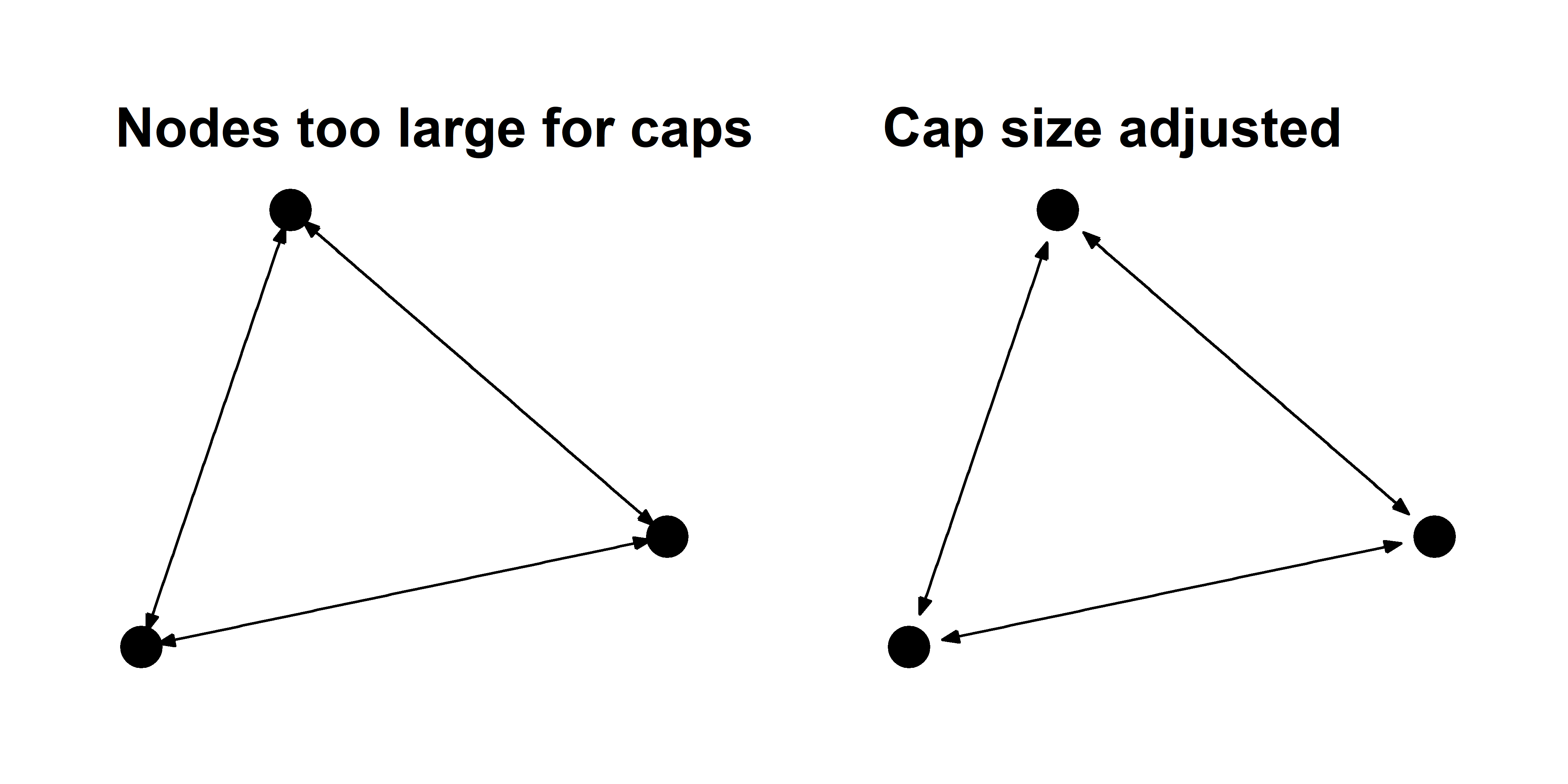
That looks much nicer. But as you change the size of your nodes, you may also have to change the size of the caps. This is an annoying reality but it is something to keep an eye on. You can see what I mean in the examples below.
You can also use curved edges called arcs to illustrate reciprocal edges. These function just like the geom_edge_link layer, but they have an additional strength argument that controls the curvature of the arcs.
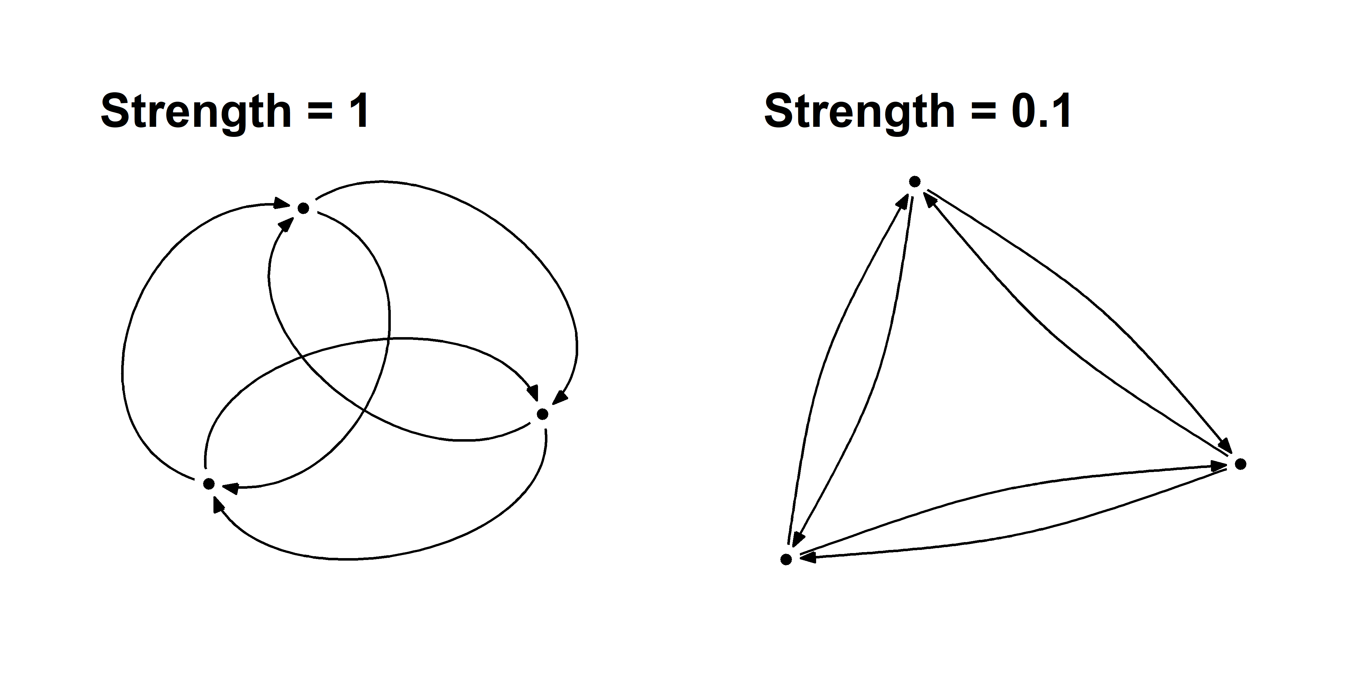
You must be very careful using arcs because they effectively double the number of edges anywhere there is reciprocity, which can add unnecessary density to your graph.
Revisiting the reciprocity graph
Now let’s apply the arrow techniques to the reciprocity graph from above.
sim_g %>%
    ggraph() +
    theme_graph() +
    geom_edge_link( aes(color=Reciprocity),
                    arrow = arrow( angle=20, length = unit(1, 'mm'), type = 'closed'),
                    end_cap = circle(1,'mm'),
                    start_cap = circle(1,'mm')) +
    geom_node_point( ) +
scale_edge_color_manual( values = c('#aaaaaa55','black')) 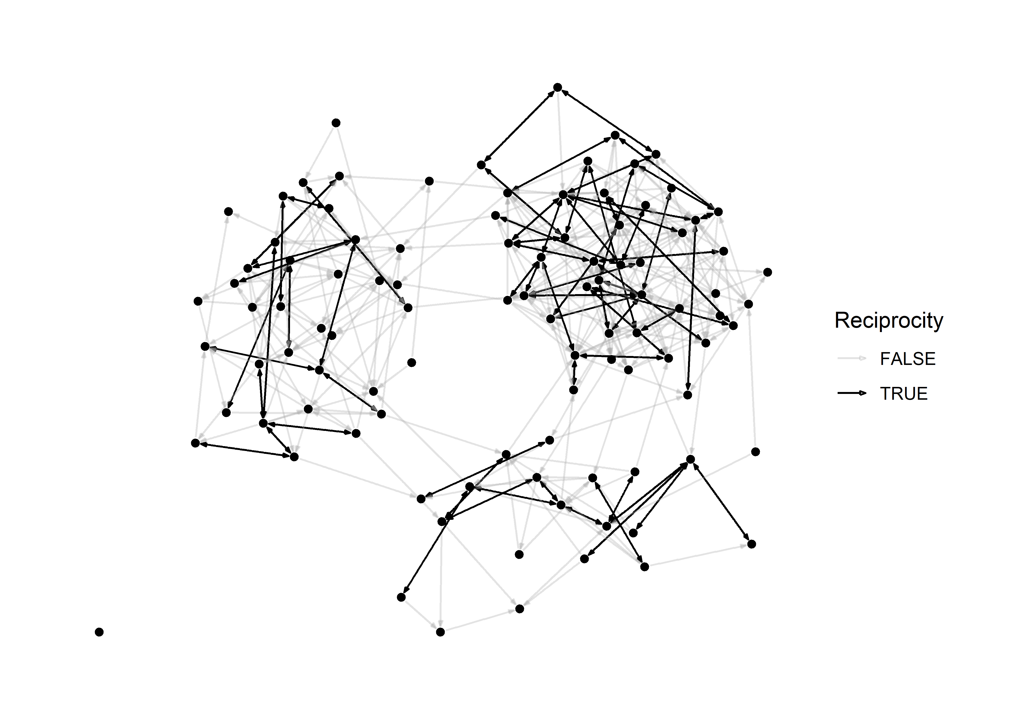
In principle, we don’t really even need nodes to visualize this graph because they provide little information. This is what it looks like when we omit them.
sim_g %>%
    ggraph() +
    theme_graph() +
    geom_edge_link( aes(color=Reciprocity),
                    arrow = arrow( angle=20, length = unit(1, 'mm'), type = 'closed'),
                    end_cap = circle(1,'mm'),
                    start_cap = circle(1,'mm')) +
    #geom_node_point( ) +
scale_edge_color_manual( values = c('#aaaaaa55','black')) 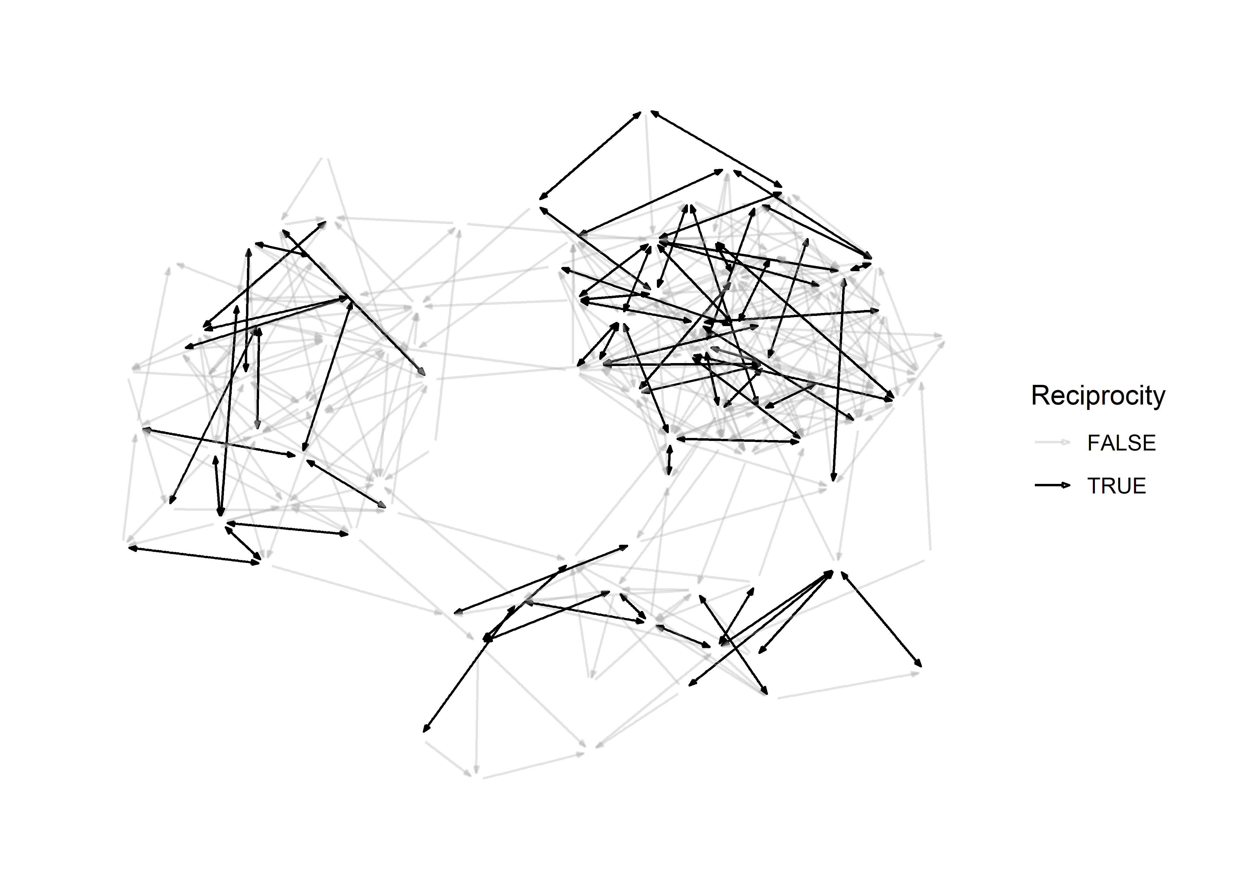
This teaches us an important lesson:
If an aesthetic provides no additional information, you should omit it.
Large graphs
A visualization problem that many network scientists encounter is the “hairball” effect. When plotting a large network it can be impossible to prevent edges from overlapping, and this causes the network to appear like a big hairball.
# make hairball
N = 1000
empty_g = network(N, directed = T, density = 0)

# make a network with 1 component
sim_g = simulate( empty_g ~ edges + mutual + ostar(3) + odegree(0) + idegree(0), coef=c(-8,3,2,-8,-8) )

# density
network.edgecount(sim_g) / (N*(N-1))
## [1] 0.003808809plot(sim_g)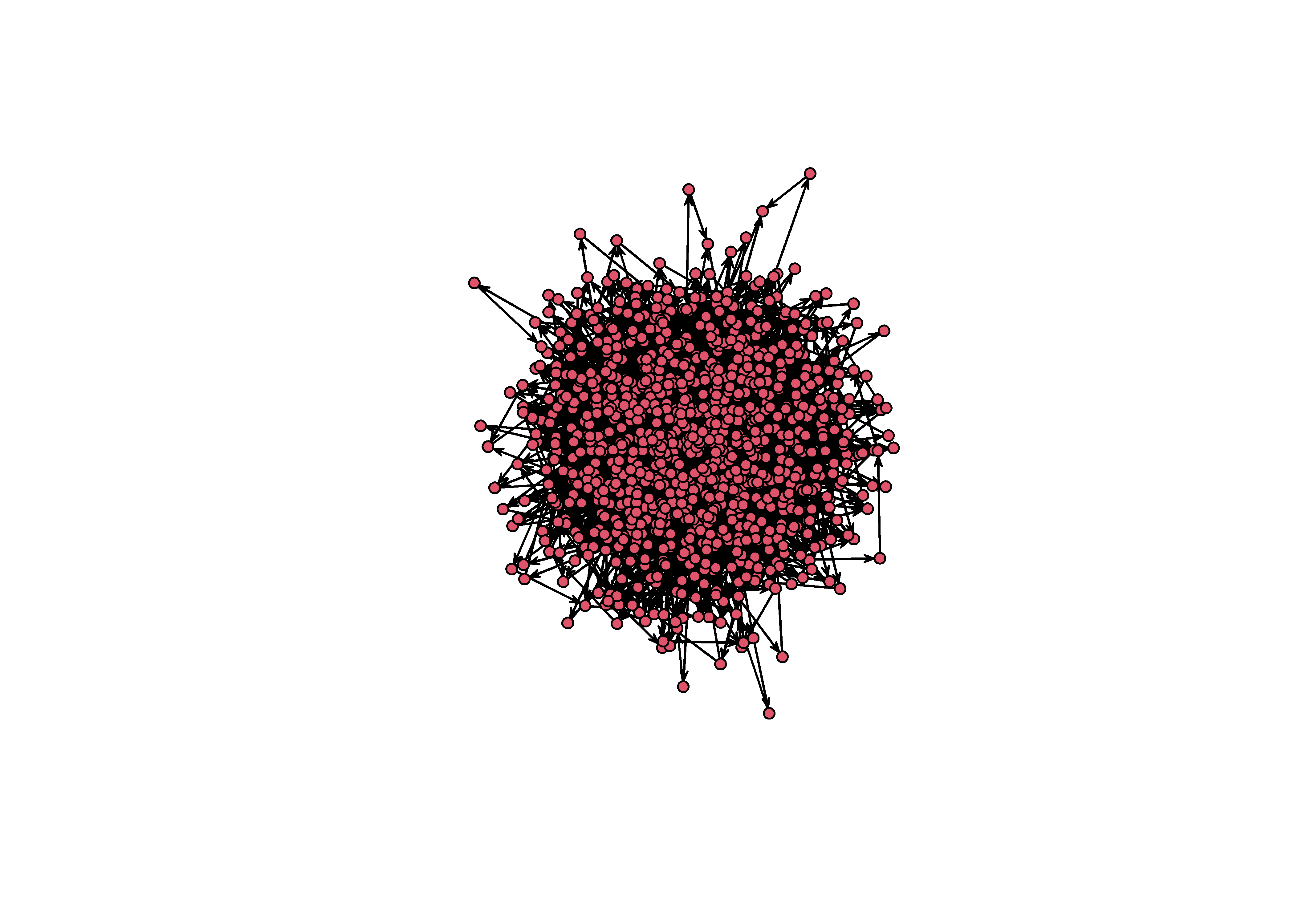
Figure 3: An unforunate hairball. Note that this is a network with a very low density (0.003)!
What can we do in this scenario? Aside from finding substructures and using small multiples, we can work with minimum spanning trees, focus on the core-peripher, or use a block model.
Minimum spanning tree
The minimum spanning tree (MST) identifies the subgraph of a network in which all vertices are connected without any cycles. By definition, a MST has N-1 vertices, so it is essentially a method of pruning a complicated graph to identify the it’s most essential structure.
mst = minimum.spanning.tree(intergraph::asIgraph(sim_g))
plot(intergraph::asNetwork(mst))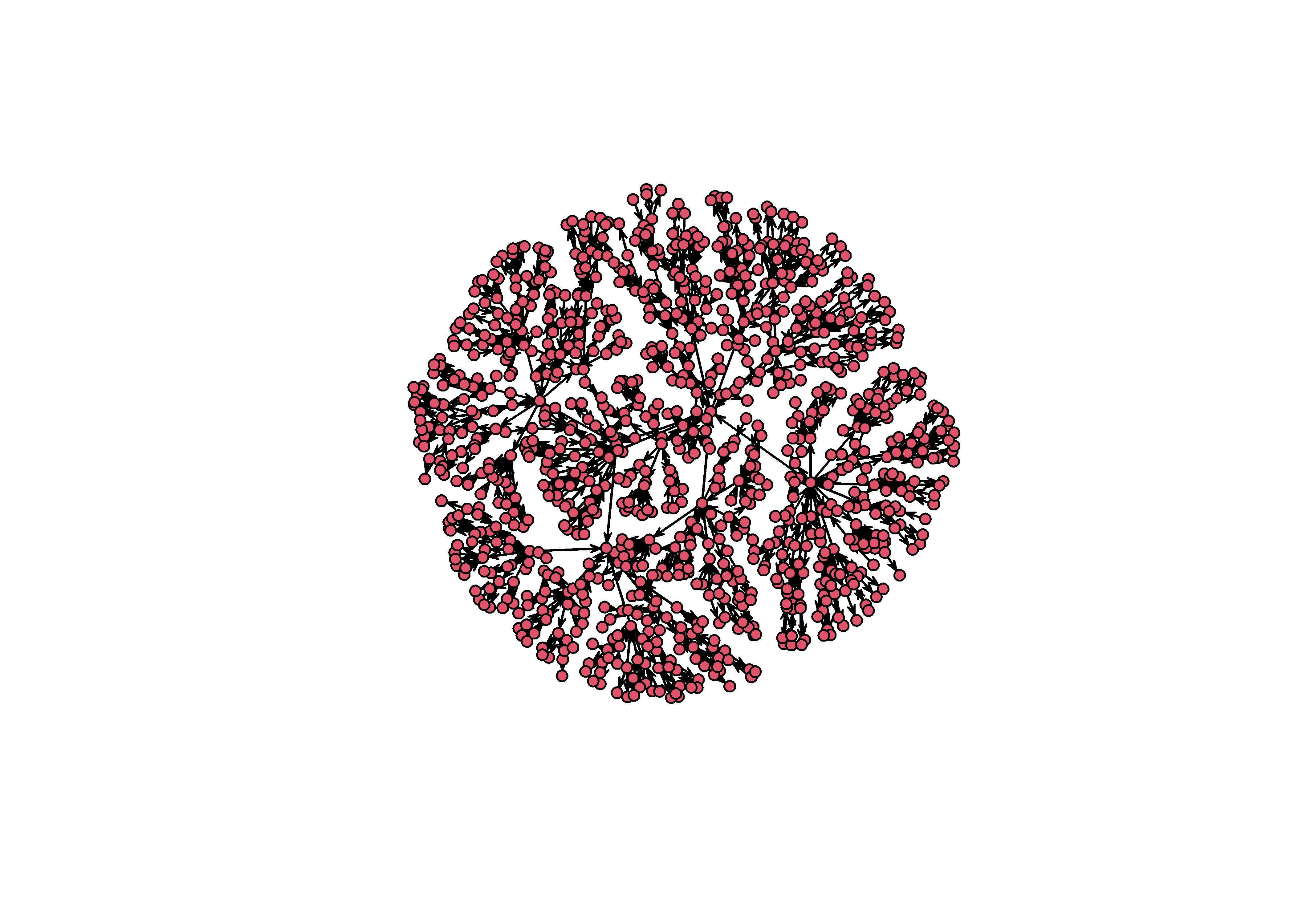
The MST is, of course, not the actual graph from the original simulation. By using it, you are transforming the network in a principled way. What the tree shows is the hierarchical structure of a graph, or the attachment network that underlies a particular hairball2.
So we need to take special care when using the MST, but it can be useful when you want to visually reveal structure that is otherwise hidden in a hairball.
Core-Periphery
One decent option we have to plot a dense graph is to identify the nodes that form the core and periphery of the network. To do this, we use a function in igraph called graph.coreness to find the k-cores of the graph. This function partitions a network into subgroups based on their degree centrality. The function below is provided by Jordi Casas-Roma on his blog.
KCoreLayout <- function(g) {
  coreness <- graph.coreness(g)
  xy <- array(NA, dim=c(length(coreness),2))

  shells <- sort(unique(coreness))
  for(s in shells) {
    v <- 1 - ((s-1) / max(s))
    nodes_in_s <- sum(coreness==s)
    angles <- seq(0,360,(360/nodes_in_s))
    angles <- angles[-length(angles)]
    xy[coreness==s,1] <- sin(angles) * v
    xy[coreness==s,2] <- cos(angles) * v
  }
  return(xy)
}
To create the visualization we need to calculate the k-cores as node attributes so that these can used in the graph.
sim_ig = intergraph::asIgraph(sim_g)
V(sim_ig)$core = graph.coreness(sim_ig)
Then we use the KCoreLayout function to save the layout for this graph and then feed it into our ggraph approach like so.
lo = KCoreLayout(sim_ig)

sim_ig %>%
    ggraph(lo) +
    theme_graph() +
    geom_edge_arc(strength = 0.1, alpha=0.1) +
    geom_node_point( aes(fill=factor(core)), pch=21, size=2 ) +
    coord_fixed()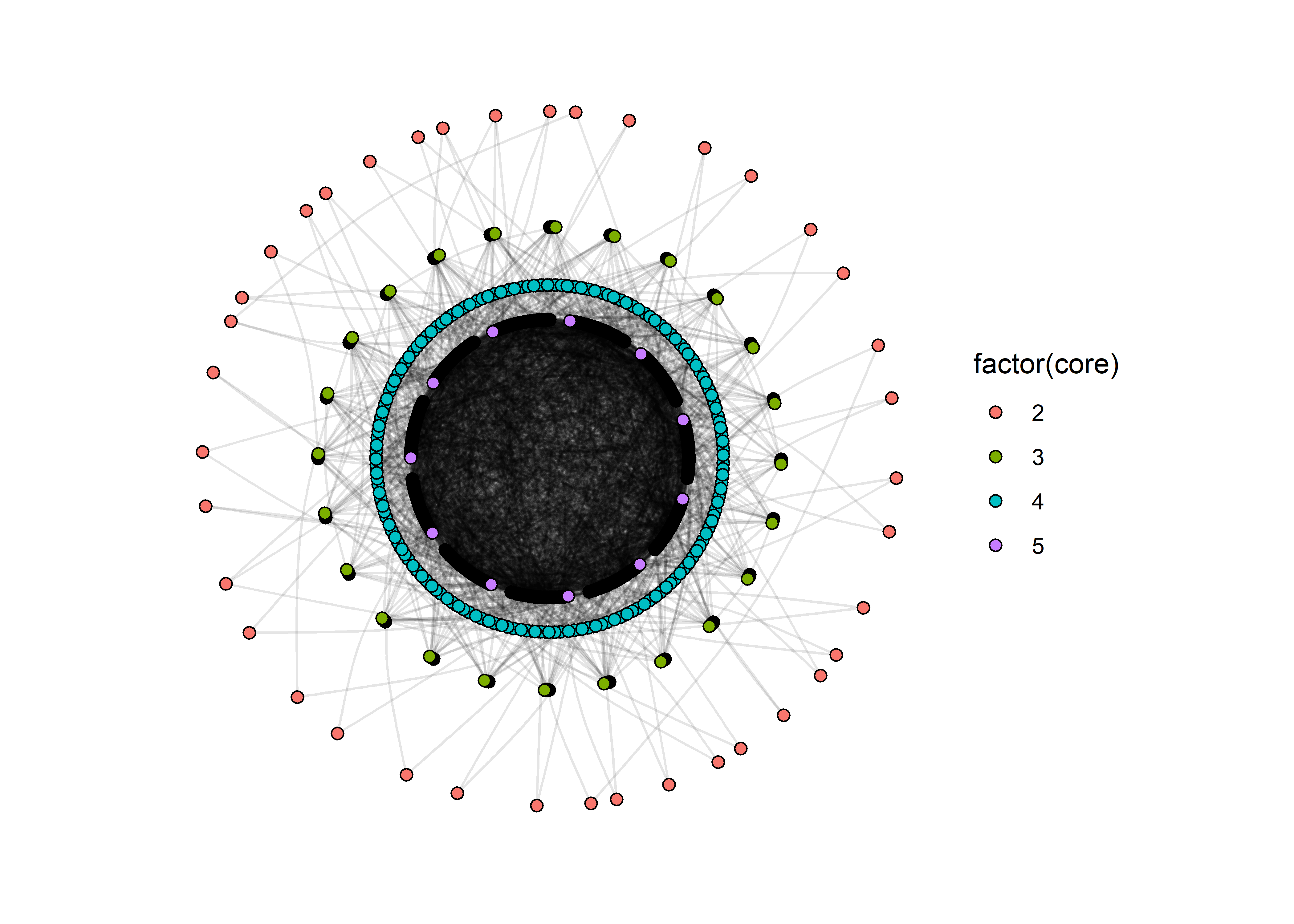
This graph still suffers from a problem: the edge that make up the innermost core are still very difficult to distinguish. But this is still better than the hairball because we have some separation between the key layers in the network.
Block models
patchworkhas many other functions that allow you to assemble plot layouts, add labels to plots, and choose relative heights and widths. Learn more from the author at https://patchwork.data-imaginist.com/↩︎Any network created using a preferential attachment model is by definition a minimum spanning tree.↩︎