Preamble
In this post, I will demonstrate how to use tools from the statnet collection of packages to simulate and model networks. The purpose of this post is to provide readers with tools that I wish I had when I first started using network analysis. I’m not an expert and I’m still learning how to use these tools well. But knowing they exist and how to use them will enable you to creatively study network processes and validate your prior knowledge of and conclusions about the networks that you study.
Why simulate?
Before we get into the content, let me first pose a question about simulation: why should we use simulation in our data analysis? Well, simulation can be pretty fun, but I am biased, so here are some better reasons.
- Connect theory to practice.
- Practice analysis before you have data.
- Improve research design.
- Contribute to open science.
Simulation forces you to make careful decisions about the processes that generate a network. These decisions are much improved if you draw on existing theory and published literature. So a focus on simulation will help you connect theory to method in a practical way. Additionally, simulation let’s you work with (synthetic) data before you have started collecting a network. This greatly improves research design because you’ll know, before you start data collection, what kinds of variables and sample sizes are needed to detect patterns. Having a prior understanding of candidate models and variables makes it easier to explain your conclusions once you’ve collected and analyzed empirical data and your simulations can be readily shared. This kind of open science improve reproducibility and helps the scientific community validate and improve theory.
The tools
Throughout this post, I’ll be using several packages. I’ll use the statnet collection for many of the network tasks, but I’ll also dip into the tidyverse for data wrangling. I use igraph for very specific data management tasks and intergraph to switch between network and igraph objects.
library(tidyverse)
library(igraph)
library(intergraph)
library(statnet)
library(tidygraph)
library(ggraph)
Specifying formulas with ergm-terms
Whether you are simulating or modeling a network, the formula syntax used within statnet remains the same. The syntax is superificially similar to syntax use in lm and glm in R. Here is a simple example:
network ~ edges + mutual + nodematch('group')
On the left of the tilde, we include our network object. On the right of the tilde are three terms. The edges and mutual terms are part of the ergm package and they codify network structures. For example, edges is similar to an Intercept and is used to estimate network density. The mutual term estimates reciprocity in directed networks.
I am using the last term, nodematch, to parameterize the likelihood that two nodes that share the same attribute value (in this case group) will connect one another. This is one way to generate homophily. Some terms like nodematch require attribute arguments, while structural terms, like mutual or edges, don’t necessarily require attributes. To view all of the terms in the Help tab, call ?ergm-terms.
Initializing an empty network
The first step in our workflow is to initialize a network of N vertices with no edges (density = 0). We will eventually set parameters for each term that we will used to generate the network. For now the initialized network object serves as a container for the network that we will generate.
set.seed(777)                      # reproducibility
N <- 20                            # N vertices
net1 <- network(N, directed = T, density = 0)    # edge density
net1
## Network attributes:
## vertices = 20
## directed = TRUE
## hyper = FALSE
## loops = FALSE
## multiple = FALSE
## bipartite = FALSE
## total edges= 0
## missing edges= 0
## non-missing edges= 0
##
## Vertex attribute names:
## vertex.names
##
## No edge attributesIf we were only using structural terms like edges, then we could simulate without creating attributes, but terms based on attribute conditions need attributes assigned to the network object. For simplicity, let’s just assign two color attributes: purple and green. We just have to make sure the length of our attribute vector matches the length of N.
# some colors
cols <- c('purple','green')

# sample from `col` and assign to net1
net1 %v% 'vcolor' <- sample(cols, size = N, replace = T)
net1 %v% 'vcolor'
## [1] "green" "purple" "purple" "green" "green" "green" "green" "purple"
## [9] "purple" "green" "green" "green" "green" "green" "green" "purple"
## [17] "green" "purple" "purple" "purple"Parameterization and calibration
The next step is to set the coefficients that the simulate will use to generate the network. The scale used to specify these coefficients is in log-odds, which can be a bit challenging to conceptualize without a reference point. It is somewhat easier if you convert log-odds into probabilities:
logit2prob <- function(coef) {
  odds <- exp(coef)
  prob <- odds / (1 + odds)
  return(prob)
}
Use this reference point when setting a coefficient:
When the log-odds are 0, this is the same as a 0.5 probability.
See for yourself.
logit2prob(0)## [1] 0.5In practice you would use theory and published studies should help you decide coefficient parameters. For now, we’ll generate a sparse network (density ~0.02) where there is a half chance of reciprocity (log-odds = 0) and homophily is probable (log-odds = 2)
# density (probability) to log odds
qlogis(0.02)        # -3.8
## [1] -3.89182# model formula
form1 <- net1 ~ edges + mutual + nodematch('vcolor')
# coefficients must be same order and length as terms to the right of ~
coefs <- c(qlogis(0.02),0,2) Now place the formula and coefficients inside simulate and store the results.
sim1 <- simulate(form1, coef = coefs)
sim1
## Network attributes:
## vertices = 20
## directed = TRUE
## hyper = FALSE
## loops = FALSE
## multiple = FALSE
## bipartite = FALSE
## total edges= 27
## missing edges= 0
## non-missing edges= 27
##
## Vertex attribute names:
## vcolor vertex.names
##
## No edge attributes# plot networks
gplot(sim1, vertex.col = sim1 %v% 'vcolor')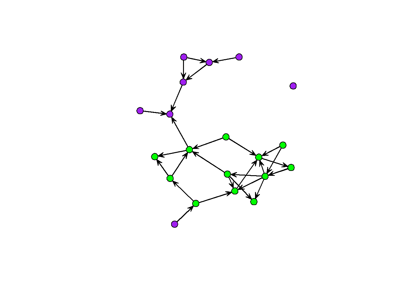
You can do simulations like these over and over for different combinations of coefficients. The iterated workflow of sweeping through parameter estimates is something we will cover in the next example. For now, here are the important steps:
- specification: remember the formula
network ~ ergm-terms; explore?ergm-termsand create attributes for specific terms. - initialization: create a network with
Nnodes and 0 edgedensity. - parameterization: choose coefficient values for each of your simulation terms.
- inspection: use descriptive graphs and summary statistics to understand the output of your simulation.
Birds of a feather
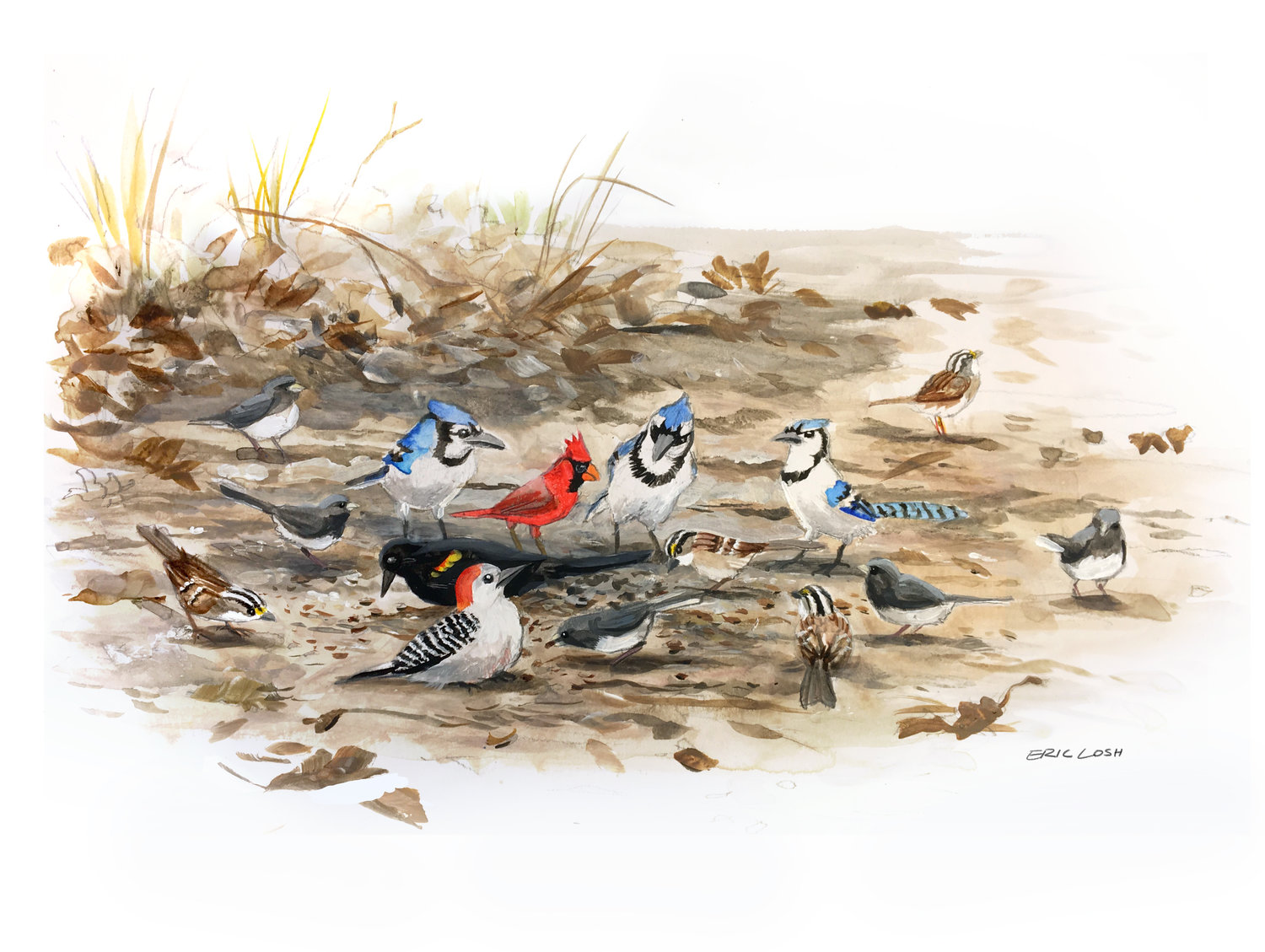
Artwork by Eric Losh
Flocking behavior is an interesting social phenomenon and it turns out that some birds like to hang out in mixed-species flocks. Let’s simulate some flocking interactions and see what kind of networks arise. We’ll start by picking up where we left off with homophily.
Flock together
Birds who prefer to interact with their conspecifics would be an example of intraspecific homophily. So let’s initialize a network with a vertex attribute for species and vary the strength of intraspecific preference.
# initialization
N_birds <- 30
N_sp <- 5        # how many species?
flock <- network(N_birds, directed = F, density = 0)
Now assign a species to each vertex. We’ll just index each species with an integer, and sample from those integers. In practice this will be based on observations and species identifications.
# species vector
species <- sample( 1:N_sp,          # species index
                   size = N_birds,  # N samples = N birds
                   replace = T)     # replace index after each sample
# assignment
flock %v% 'species' <- species
flock %v% 'species'
## [1] 3 5 3 3 5 4 4 3 1 5 1 4 3 5 5 4 2 3 4 5 1 3 2 1 3 3 4 3 3 3It’s possible that not every species would have the same number of individuals. We can alter this by using the prob argument in sample. For simplicity, I’m just going to assume all species are evenly abundant.
Density parameter
The model formula for this simulation is: flock ~ edges + nodematch('species'). But we need to choose coefficients for each of the terms. We know that homophily should be positive, but it’s hard to know what the log-odds for density should be.
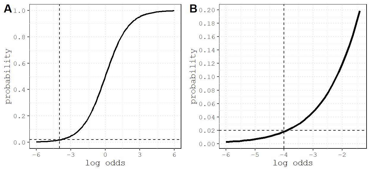
Figure 1: Many networks are sparse, with fewer than 2% of all possible edges present. This corresponds appoximately to -4 log odds (reference lines). A) Relationship between log odds and probability; B) zoomed in on -4 and 0.02.
Parameter sweeps
If we really want to understand the impact of homophily, we should simulate several networks with different coefficient values for nodematch('species'). We can do this by creating a sequence of coefficient values (on the log odds scale), and using a for loop to simulate one network for each value. To reduce the computational load, I’m going create a sequence of 9 values for 9 different networks.
N_sims <- 9                              # number of simulations
Hseq <- seq(-2,2, length.out = N_sims)   # length.out controls breaks
Hseq
## [1] -2.0 -1.5 -1.0 -0.5 0.0 0.5 1.0 1.5 2.0I also need a container for the results. I’ll use an empty list.
L <- list() Now write a for loop that cycles through each value of Hseq, uses that value as a coefficient for a simulation, and plots the result. Keep density constant at -5 to see the effect of homophily changing from negative to positive.
# plotting grid parameters
par(mfrow=c(3,3), mar=c(2,2,2,2))

# loop through sequence
for(i in seq_along(Hseq)) {

  # simulate every value of Hseq
  L[[i]] <- simulate(flock ~ edges + nodematch('species'),
                     coef = c(-5, i),
                     seed = 777)

  # plot resulting network with minimal aesthetics
  gplot( L[[i]],
        vertex.col = L[[i]] %v% 'vcolor',
        edge.col = adjustcolor('black', alpha.f = 0.5),
        arrowhead.cex = 0.1,
        main=paste('homophily =', round( logit2prob(Hseq[i]), digits = 2)))
}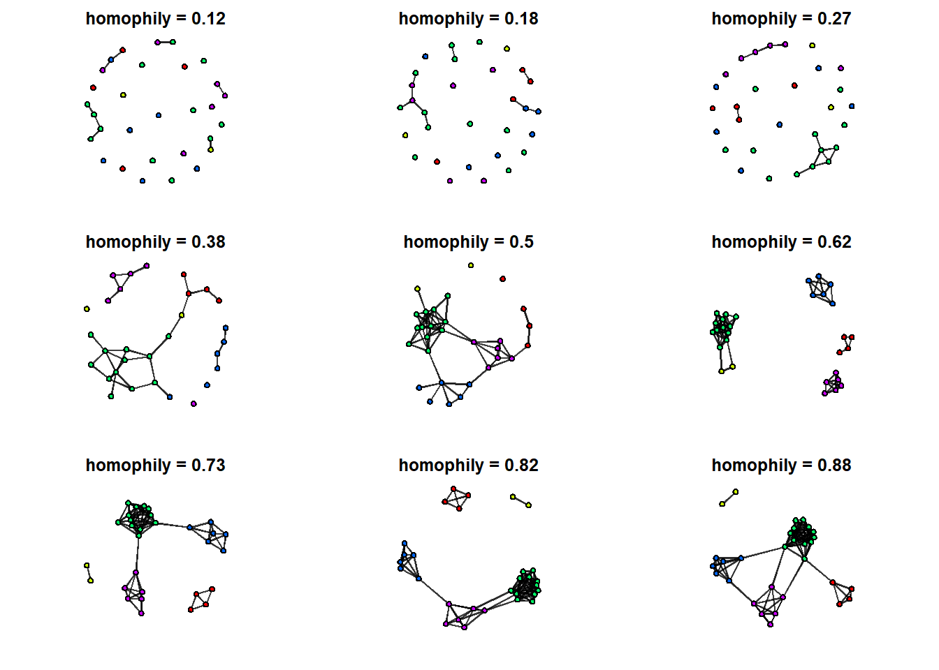
We can see qualitative changes in the network structure from one graph to the next. For a quantitative description of the changes, let’s plot the degree distributions for each of these 9 networks.
# first I calculate degree centrality for each node in all 9 networks
G <- lapply(L, degree)

# convert list to data.frame
names(G) <- Hseq         # name the list
df <- bind_rows(G)       # collapse list since each element same dimensions
head(df)
## # A tibble: 6 x 9
## `-2` `-1.5` `-1` `-0.5` `0` `0.5` `1` `1.5` `2`
## <dbl> <dbl> <dbl> <dbl> <dbl> <dbl> <dbl> <dbl> <dbl>
## 1 2 2 2 8 8 18 12 20 20
## 2 0 0 4 2 12 10 8 12 12
## 3 0 0 6 2 14 12 18 20 22
## 4 0 2 0 6 14 10 20 22 22
## 5 2 0 4 4 8 8 10 12 10
## 6 0 0 0 2 12 8 10 10 10Now we can usedf – which contains 9 columns of degree centrality scores 9 simulated network – to plot the distributions and compare the effects. Explaining how to plot these is beyond this scope of this document, but there are many plotting tutorials available (including my own).
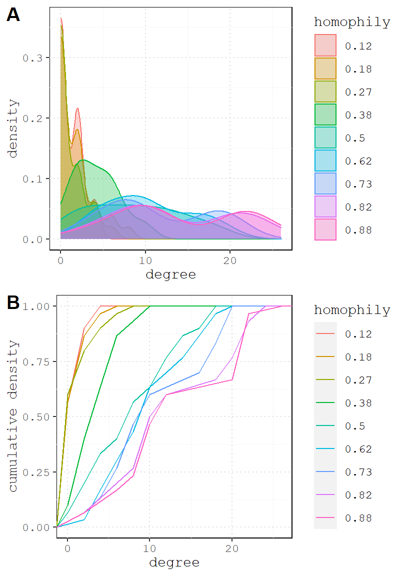
Looking at the graphs, it is clear that as homophily increases, so does the density. But I thought we held density constant? We did in one sense. Another way to describe the edges parameter is the probability that an edge connect any two nodes, regardless of their attributes.
Once we add homophily, we create a lot of possible species pairs in this network (each species has ~15 members), and as we increase the odds, more edges form. A consequence of this is that it increases the network density above and beyond edges coefficient. This is evident in graph A: the peak density for each value of nodematch flattens and shifts to the right, suggesting that increased homophily uniformly improves the degree centrality of all vertices on average.
Body size
In a 2012 paper, Farine, Garroway, and Sheldon use network analysis to study a mixed species flock made up of blue tits (Cyanistes caeruleus), coal tits (Parus ater), great tits (Parus major), marsh tits (Poecile palustris), and nuthatches (Sitta europaea). Two hypotheses – vigilance and foraging efficiency – are thought to explain some aspects of group composition, and both are connected to body size and dominance.
Larger individuals tend to be more dominant within groups of birds and fishes. A consequence of this is that dominant individuals tend to face less competition from social partners, which makes them more efficient foragers. They can also deter predators more easily, which makes them effective vigilantes. So the expectation of Farine, Garroway, and Sheldon is that larger birds should have more flocking partners. They also argue that, in general, birds ought to prefer heterospecifics (i.e. no homophily) because by focusing in different species they are more likely to encounter a variety of body sizes, thereby increasing their chances of foraging with an efficient and protective partner.
Creating wingspan and length variables
How should we decide what size to make each bird? There are many sources of information, but we want to keep it rough dirty, so let’s just visit the British Trust for Ornithology. Here is what they say:
##        bird length wingspan
## 1 great tit     14       24
## 2  coal tit     12       19
## 3  blue tit     12       18
## 4 marsh tit     11       19
## 5  nuthatch     14       24
So let’s add our own wingspan and length variables by drawing random values centered around the values in the table above.
First, we’ll sample from the bird column to get our species groups.
# set seed and number of birds
set.seed(27)
N_birds <- 30

# sample from species common names
df <- data.frame(
  species = factor(sample(BTO$bird, size = N_birds, replace = T))
)
Then we’ll merge our newly sampled birds with the BTO table to get our mean wingspan and length values.
# merge to get length and wingspan
df <- merge(BTO, df, by.x = 'bird', by.y = 'species')
head(df)
## bird length wingspan
## 1 blue tit 12 18
## 2 blue tit 12 18
## 3 blue tit 12 18
## 4 blue tit 12 18
## 5 blue tit 12 18
## 6 coal tit 12 19Now we will group_by the bird column and use mutate two create two new variables: sim_wingspan and sim_length. Note that we use the wingspan and length variables embedded inside of the rnorm function. The makes it so that the mean value for the random draw changes according to the group. Finally the function n() tells mutate how many rows are associated with each bird group – this is the number of random draws that we need.
# use dplyr to sim new variables
df <- df %>% group_by(bird) %>%
  mutate(sim_wingspan =  rnorm(n(), wingspan, 4),
         sim_length = rnorm(n(), length, 4))
df
## # A tibble: 30 x 5
## # Groups: bird [5]
## bird length wingspan sim_wingspan sim_length
## <chr> <dbl> <dbl> <dbl> <dbl>
## 1 blue tit 12 18 18.3 15.2
## 2 blue tit 12 18 17.7 6.97
## 3 blue tit 12 18 6.01 18.8
## 4 blue tit 12 18 13.1 15.4
## 5 blue tit 12 18 14.0 13.3
## 6 coal tit 12 19 20.3 16.4
## 7 coal tit 12 19 24.2 13.7
## 8 great tit 14 24 25.3 18.1
## 9 great tit 14 24 23.4 9.48
## 10 great tit 14 24 20.2 15.8
## # ... with 20 more rowsIt might be easier to visualize what we’ve done if we plot the new distributions.
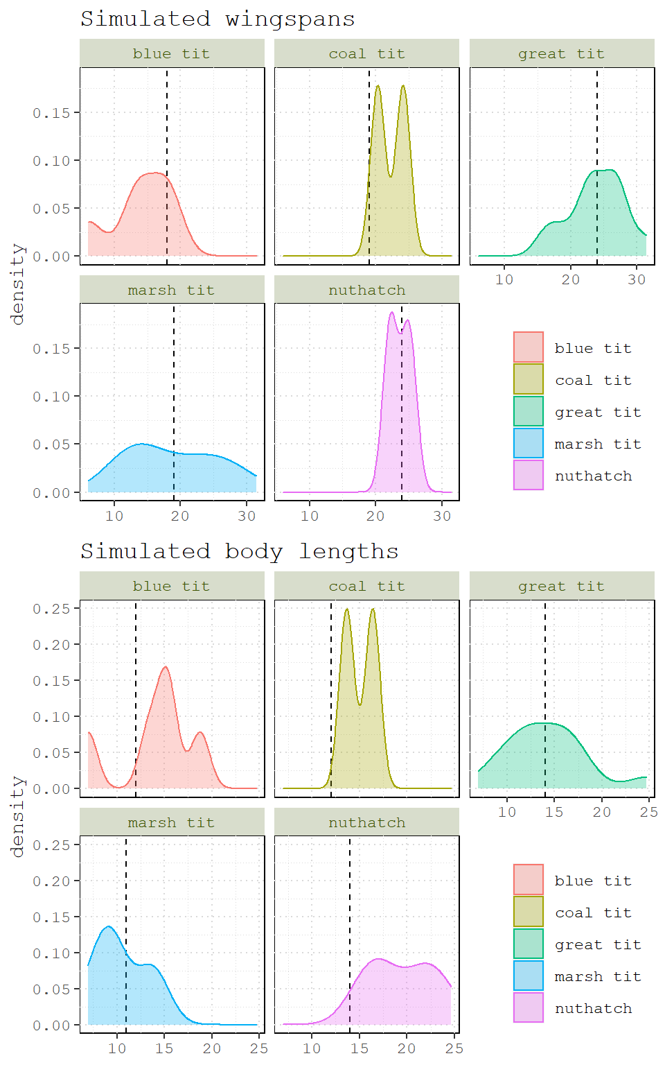
Figure 2: Simulated wingspans and body lengths for five bird species. Dashed lines indicate wingspan and body length values from the British Trust for Ornithology.
One final step we need to take is to rescale our variables. This will make it much easier to choose coefficients that are comparable.
df <- df %>% ungroup() %>%
  mutate(s_wingspan = (sim_wingspan - mean(sim_wingspan)) / sd(sim_wingspan),
         s_length = (sim_length - mean(sim_length))/ sd(sim_length))
df
## # A tibble: 30 x 7
## bird length wingspan sim_wingspan sim_length s_wingspan s_length
## <chr> <dbl> <dbl> <dbl> <dbl> <dbl> <dbl>
## 1 blue tit 12 18 18.3 15.2 -0.470 0.212
## 2 blue tit 12 18 17.7 6.97 -0.578 -1.64
## 3 blue tit 12 18 6.01 18.8 -2.59 1.03
## 4 blue tit 12 18 13.1 15.4 -1.37 0.275
## 5 blue tit 12 18 14.0 13.3 -1.22 -0.200
## 6 coal tit 12 19 20.3 16.4 -0.127 0.493
## 7 coal tit 12 19 24.2 13.7 0.532 -0.125
## 8 great tit 14 24 25.3 18.1 0.726 0.872
## 9 great tit 14 24 23.4 9.48 0.396 -1.07
## 10 great tit 14 24 20.2 15.8 -0.158 0.357
## # ... with 20 more rowsExtending the homophily model
Let’s add body size to our homophily model. We’ll use the same iterated workflow as before, but we won’t use all values of homophily; instead, we’ll conduct one set of simulations where homophily is positive (2) and another negative (-2). But first, we need to initialize our network for the simulation.
# initialize
flock2 <- network(N_birds, directed = F, density = 0, vertex.attr = df)
Notice that this time, I added the vertex attributes directly when I initialized the network (vertex.attr = df).
flock2## Network attributes:
## vertices = 30
## directed = FALSE
## hyper = FALSE
## loops = FALSE
## multiple = FALSE
## bipartite = FALSE
## total edges= 0
## missing edges= 0
## non-missing edges= 0
##
## Vertex attribute names:
## bird length s_length s_wingspan sim_length sim_wingspan vertex.names wingspan
##
## No edge attributesNow let’s construct the model formula. We already know that we can use nodematch for species homophily and edges for network density. For the effect of body size, let’s use nodecov – a term that adds one statistic to the network that covaries with a node attribute, in this case s_wingspan.
# simulation formula
formula2 <- flock2 ~ edges + nodematch('bird') + nodecov('s_wingspan')
Next we need a sequence of coefficients for s_wingspan that we will loop through.
Wseq <- seq(-2,2, length.out = 9)Now we need a workflow to test negative and positive homophily. We could try to embed a loop within a loop, but it’s probably easier to just run two separate loops for each scenario. Remember, we’re just changing the coefficient for homophily from -2 to 2.
# containers
neg <- list()
pos <- list()

# negative homophily
for( i in seq_along(Wseq)) {
  neg[[i]] <- simulate(formula2, coef=c(-5,-2,i), seed=777)
}

# positive homophily
for( i in seq_along(Wseq)) {
  pos[[i]] <- simulate(formula2, coef=c(-5, 2,i), seed=777)
}
Let’s loop through a plot a few of our simulations. In practice, you’ll have many simulations. But for clarity, I’m only going plot 4 from each of the scenarios. First the negative homophily simulation.
P <- list()
for(i in seq_along(Wseq)) {
   g <- asIgraph(neg[[i]])
   # plot w/ ggraph
   gg <- as_tbl_graph(g) %>%
     activate(nodes) %>%
     #calculate degree centrality
     mutate(degree = centrality_degree()) %>%
     ggraph('stress') +
     geom_edge_link0(alpha=0.5) +
     # remove isolates
     geom_node_point(aes(filter = degree > 0, size=degree, color=bird)) +
     theme(panel.background = element_blank())  +
     # remove legends
     scale_size_continuous(guide = 'none') +
     scale_color_discrete(guide = 'none') +
     # convert to probability
     ggtitle(paste('body size =', round(logit2prob(Wseq[i]), digits = 2)))

   P[[i]] <- gg

}

# choose 4
cowplot::plot_grid(P[[1]], P[[2]], P[[4]], P[[5]])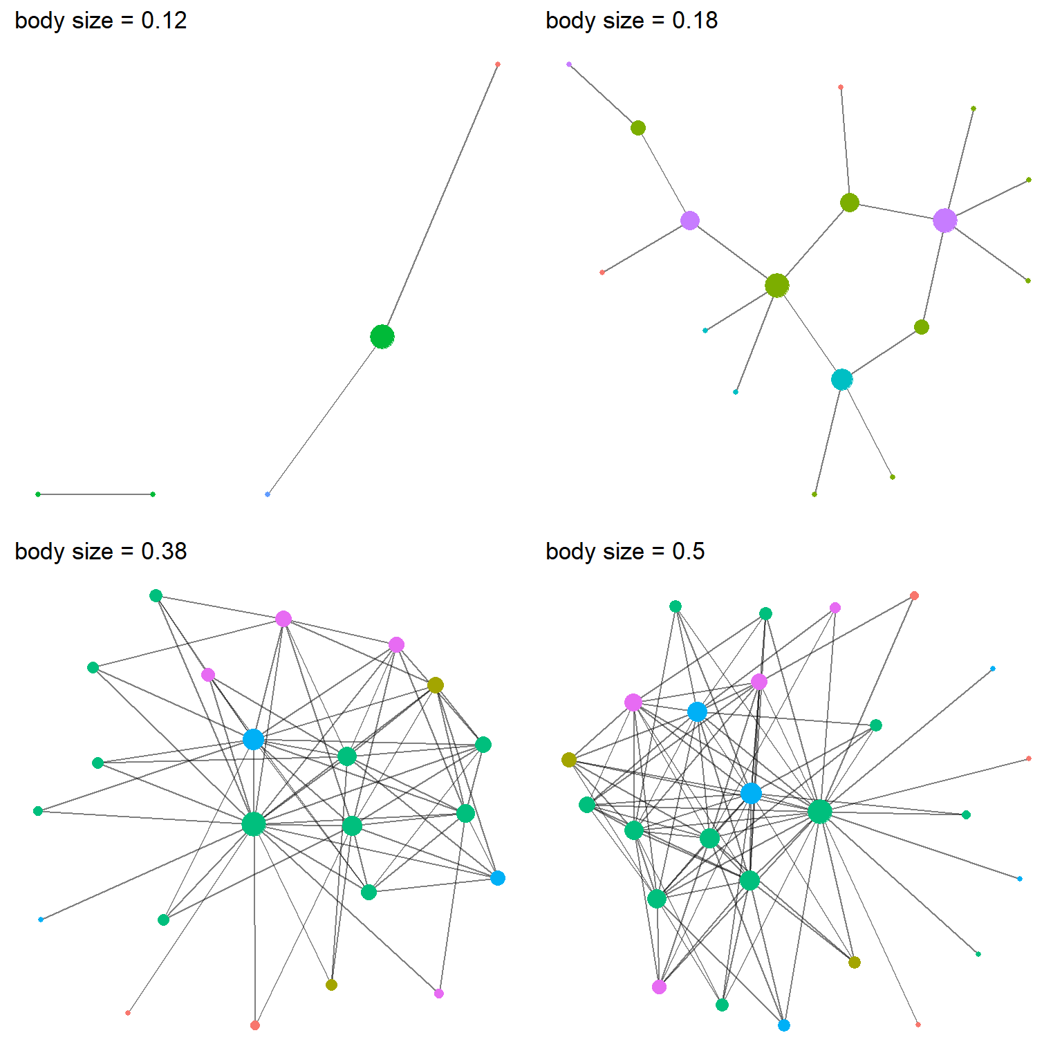
Figure 3: Four networks from the negative homophily simulation, each different parameters for the influence of body size. Node color represent species and node size represents the number of partners (i.e., degree centrality).
And again for the positive homophily simulation. The code is the same – we just swap pos for neg – so for brevity, it is omitted.
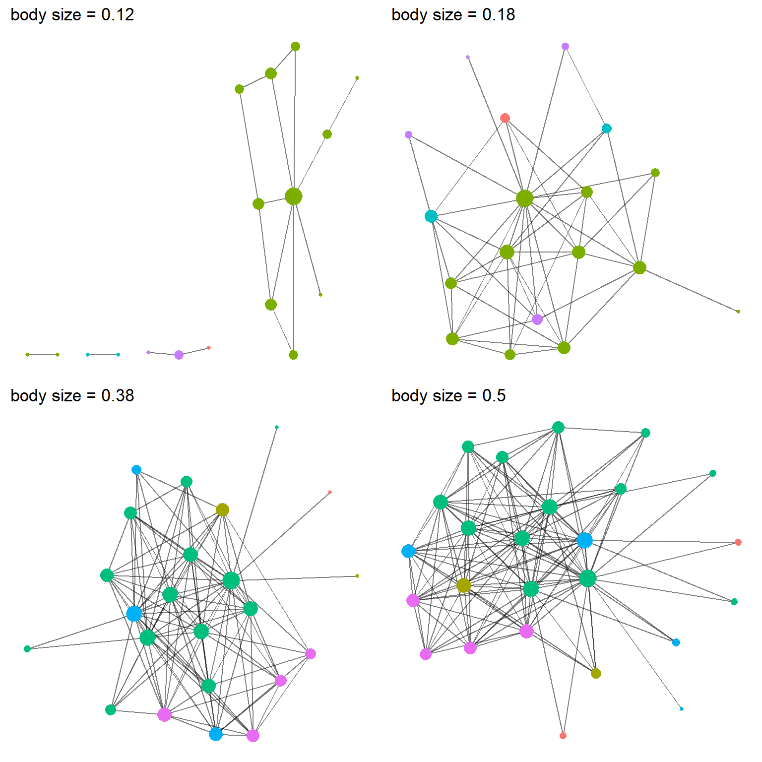
Figure 4: Four networks from the positive homophily simulation, each different parameters for the influence of body size. Node color represent species and node size represents the number of partners (i.e., degree centrality).
It’s actually pretty hard to tell the differences from graph to graph and simulation to simulation. But one thing is pretty clear, the effect of body size does not need to be very strong. In fact, when it reaches a probability of 0.5, it makes it so that every bird appears dominant.
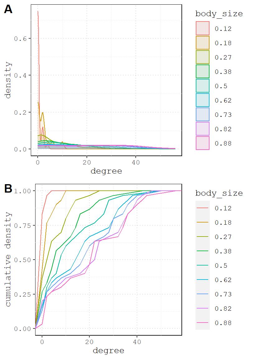
Let’s visualize degree distribution like we did above.
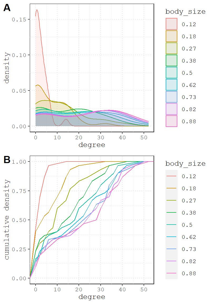
And the positive version.
One important takeaway from the simulation above is that even when there are two totally different social processes at work (homophily and body size domination), the resulting networks can be hardly distinguishable. This is a crucial thing to recognize early on.
Extensions to try
- network size: vary the number of nodes and see how the results differ.
- sensitivity: repeat a simulation multiple using same coefficient several times. Do results change or do they remain more or less the same?
- group size: vary the sizes of the grouples using the
probargument insample. How do the resulting networks change when there is one dominant species? - one big individual: add a single individual to the network who is much larger than the rest (a blue jay?). What effect does this individual have on the degree distribution?
- structural terms: add more
ergm-termsto the simulation like triangles or k-stars. - personalities: individuals birds have different personalities; maybe some like to forage alone or with conspecifics, while other prefer heterospecifics. Add a variable to reflect this and simulate.
- valued: not all interactions are positive or neutral; maybe some interactions are negative? add values to the edges to indicate whether an interaction was positive or negative.